Is it better to photograph food as a vertical or a horizontal?
I think that each food photographer has his or her own preference on this, but personally, I usually prefer to shoot horizontally. There’s no right or wrong answer to this question, and your preference may be related to whether you lean toward advertising food photography of editorial food photography.
In editorial food photography, you’re always thinking about full-page shots, hopefully the cover of the magazine. And like I talked about in another post, editorial food photographers seem to prefer to shoot many of their photos “straight down”. From this perspective, vertical shots are just as effective and easy to shoot as horizontal ones.
If you’re a commercial shooter, you do whatever the client wants.
If you’re shooting food for your portfolio or just for the fun of it, then you can choose your preferred crop, but if you’re doing it for an assignment, then the client often tells you that they need a horizontal or vertical shot, depending on the layout. I can’t tell you how many times I’ve wanted to shoot one crop only to be told that the client needed the other. Some subjects just lend themselves to a particular crop, but if the layout requires something different, then that’s what you shoot and you make it work.
What if you need a place for headline copy?
Another thing you have to keep in mind when composing a photo is that sometimes you will need to leave room for copy (type) or a masthead (magazine logo). With a magazine cover, for example, you need a vertical photo, but the bottom square of the image is by far the most important area. This square to horizontal area at the bottom of the page is what most people will see most, but still, the whole photo is a vertical and the upper half of the image doesn’t get as much attention. These are the shots that often look a little weird without the type in your portfolio or on your website. The printed piece looks great, but the naked images looks a little weird with all the negative space up top or over in the corner. I usually just crop the photo differently for my website and no one knows anything different.

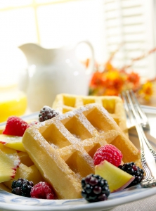
This was shot as a magazine cover, so I needed to leave room for the masthead at the top of the photo, but I could of just as easily made a horizontal out of the bottom half of the photo.
If I’m shooting just for me, I prefer horizontal
I usually like to shoot horizontally. I normally prefer to shoot from a relatively low camera angle and this ends up making the plate of food a horizontal oval, which fits nicely into a horizontal photo. If you need to make a vertical with a low angled shot, then you end up either cropping off a lot of plate, or you need to pull way back to get the entire plate in the shot. When you do that, you end up with a TON of background to fill in with props or an interesting environment of some kind. Sometimes I even run out of table surface and then need to add a wall or vertical background. This ends up complicating the shot and makes it more expensive for the client. Sure, it might look nice, but clients usually prefer less expensive when given a choice.
I have a client that asks me to shoot both versions of the same shot
What I do is I end up setting up first for the horizontal shot and then just flip the camera and try not to zoom out too far. I usually try to crop the plate a bit, and I’ve been surprised how well this has been working. The key is to be able to crop off one side of the plate and not have too zoom-out very much. This way, I don’t have to totally start over with the entire composition.
Conclusion
I guess the proof is in the pudding. If I look at my portfolio, most of my shots are horizontal. That may change over time, but for now, I prefer horizontal. That doesn’t mean one crop is better than another, it just means that I have a preference, or maybe it’s a rut, I don’t know. In fact, when I’m shooting for myself or for my portfolio shoot, I’m going to make myself do something different, just to give my portfolio a little more variety and to push myself to be a little more open-minded. And you should do the same thing. Look at r portfolio and see what you have the most of, then the next time you shoot for yourself, do something a little different.
What’s your preference and why???


I could have not expressed it any better. On target, word for word.
Great article. I personally prefer vertical images, even when shot top down. Maybe it’s to do with the fact that I started off shooting a lot of editorial, on a Mamiya 6×7…
For example looking at your shot of the waffles above, the beautifully blurred out negative space on top doesn’t really bother me, it just adds to the environment of the image and gives it a sense of space for me. If you’re ever looking at a plate of food in the kitchen which has daylight, the window at the back is almost always going to be much much brighter, which is the feeling I get here.
We have this running joke in the studio, that I will always set up a vertical shot instinctively, only to have the client remind me, that we’re doing horizontal billboards…
Though nowadays the trend with a lot of agencies seems to be to shoot both ways to allow for almost all adaptations from 2×3 vertical all the way to 4×1 horizontals….
I totally know what you mean about clients wanting everything shot both ways. I hate, but understand it…
Thanks for your info. I am thinking whether to shoot horizontal or vertical for my website. I also prefer to shoot horizontally but I saw most recipe books and websites shoot vertically that’s why I’m confused.. haha
I think that you’ll need to mix it up. Some clients think that if they sell oranges, they need to find a photographer that has experience in shooting oranges. It’s best to have some oranges in your portfolio to show those people. Shoot both…