|
I think that a good way to learn food photography is to experience the process. But since you can’t be here at the studio, I thought that I would create a few case studies and try to explain the thought process and the reasons for some of the decisions that are made at a typical food shoot. I don't consider this shot to be all that outstanding or dramatic, but there are some interesting things that a novice food photographer can learn from this shot.
While I am not including every image taken for this subject, I have included the images where I thought interesting points could be illustrated. We actually shot 53 exposures during this shoot, which is probably on the low site for the average food shot.
The assignment was to photograph a cheesecake for a family style restaurant’s promotional materials. The client was not able to attend the photo shoot, so we had to email images for approval. We’re been photographing for this client for some time, so this didn’t really present a problem, since we (the team) were familiar with the client’s preferences.
The photo was to be outlined, meaning that the plate was to be “cut out” and a background added later. This makes things a whole lot easier than if the background was to be used. This allowed us to not worry so much about multiple shadows, which would have been a concern if we needed to retain the current background.
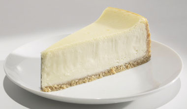
Picture #1 – This picture was the first exposure taken of the subject and probably represents how the cheesecake would actually look coming out of the kitchen of the restaurant. We shot this image so that we could email it to the client in order to discuss the cheesecake placement and the height of the camera. We didn’t have a layout, so we were just guessing about these things and needed to confirm that we were headed in the right direction. As you can see, not a lot of attention was given to the styling of our “stand-in”. I lit this shot with the lighting that was in place from the previous shot. I figured it wasn’t worth the effort of putting much time into lighting the subject since the client was probably going to chance things anyways, which they did. One important less that I learned a long time ago, is to compose first and then light. To light properly, the composition should be pretty much nailed down. If the subject even moves a little, I’ll probably need to move all my lights and mirrors too. Compose, then light.
Another thing to realize here is that two people are working simultaneously, the photographer lighting the subject, and the stylist building the cheesecake. Many times in food photography, time is of the essence in order for the food to look as fresh as possible. Fortunately for us, this is not one of those cases. Nothing in this shot has a very short shelf life, If need be, we could work on this subject for a long time without the cheesecake showing signs of deterioration.
The point in the shoot where timing would be critical, is when we were trying to catch the drip of sauce coming down the face of the cheesecake. But until then, we weren’t all that pressured. Having said that, we did have other shots to do that day, so in order to make efficient use of our time, the stylist and I worked around each other, him tweaking berries and me lighting. This sometimes makes things a little tough for each person. For the photographer, it’s sort of like trying to hit a moving target. You tend to light for what’s in front of you, but you have to keep in mind that the final styling of the subject might create something very different. For the stylist, the placement of items can be greatly influenced by the lighting. One element may cast a nasty shadow onto another element, for example. This is where experience comes into play. Both you and the stylist need to know each other’s jobs well enough to realize which of you can more easily fix a given problem. For example, it’s easier (and smarter) to spin a strawberry then move a critically placed light because of an unwanted highlight.
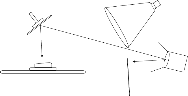
I have one hint for you here if you are interested in learning how to really light well. Look at the shadows. The shadows tell you most of what you need to know. Which outlined shots like this, the shadows are especially telling, since the photographer knows that the shadows on the background are not going to be in the final shot, and therefore doesn’t take steps to hide them. By looking at the background of this shot, you can tell that I was using two lights. (Actually one light and one mirror) You can tell this by looking that the shadows, both on the table surface and on the plate. Keep looking at the shadows and you’ll learn how to light.
Picture #2 – The client wanted us to spin the cheesecake to a different angle, but the camera height was fine. We added some more strawberries in order to illustrate the amount of strawberries that we intended to add to the hero food, and sent this jpg on to the client for approval.
I did make one change that is noteworthy here. Having done this type of photography before, I knew from experience that I would need a “glair” light. It’s not actually a light but a white reflector card behind the subject. The size of this reflector card varies from shot to shot, but in this case, I used a relatively large one, 3’ x 3’. The card’s function is to put shine on any horizontal surface in the shot, notably the plate surface and more importantly, the strawberry sauce. The sheen works to give the visual impression of “smoothness” and “lusciousness” to the food and gives some “life” to the plate by while helping to lighten any cast shadows and adding what I call “tonal undulation”. Sounds sexy, doesn’t it?
Picture #3 – Enter hero cheesecake. The stylist decided to build the cheesecake on set. This was decided because we could take images as we go and see the progression and react as needed. Another issue about this particular subject that we needed to keep in mind was that the strawberry juice would stain the cheesecake, so once the juice hit the cake, there was no going back. If you didn’t like what you did, you basically had to start over with a brand new “bald” piece of bare cheesecake.
I decided to light the cake from the right hand side, keeping the light low in order to “scrape” the light across the front surface of the cheesecake, while at the same time keeping the top surface lighter than the front surface. Many novice photographers make the mistake of lighting things too flatly. You need to differentiate the plains of an object in order to emphasize the shape of that object. This is very important in making a two-dimensional object (the photograph) look as three dimensional as possible. When I say “scrape” the light, I mean that I position the light so that it creates the most texture possible on the surface of an object. When scrapping light, the difference of an inch or two in light position, can make a huge difference! This is another thing that most novice photographers don’t realize or care about. If you want to be a good food photographer, you have to notice the details. Speaking of details, notice the card at the point of the cheesecake. That is a technique that the stylist uses to make sure that the point doesn’t crumble. We moved the card back later in the shoot, but one little piece remained visible. I noticed this and decided to fix it later with a little Photoshop. No big deal. Also, notice the far right base of the cake. The corner of the crust is in slight shadow of the lip of the plate. We noticed this and figured that we would hide that later with strawberries. It’s all about the details. It’s real easy to overlook the little things until after you get the poster back from the printer and then it jumps out at you like a sore thumb. Look at the details!
Picture #4 – Life’s a compromise… Even though I loved the shape and texture I was getting with my “big ten inch” (Norman freznel spot light). Something was really bothering me. On the last shot, take a look at the cast shadow to the left, of the plate behind the cheesecake. I hated it and couldn’t do a thing about it, if I kept with that light. The light was just too crisp. The same characteristics that gave me that beautiful texture on the cheesecake, also gave me that unsightly cast shadow on the plate. I decided that I just couldn’t live with that shadow and I know from experience that my Photoshop skills weren’t good enough to fix it later. There was another thing I was concerned about too. I was afraid of the shadows from the strawberries. I figured that the strawberry closest to the camera would cast a really large, unsightly shadow right in front of the cheesecake. So I thought I’d try something a little different. I decided to try a larger light source.
By going to a larger light source, I sacrificed the texture of the cheesecake for the softness of shadow. Is that a good idea? Trading the quality of the lighting of a prop for the quality of lighting on the subject is not usually a good idea. Shot #4 is an example of the same shot as above, only using a softer (larger) light source. Notice the cast shadow behind the cheesecake has gone away because of the softer light and the intensity of the glair or sheen card behind the cake. As you can see, the stylist continues to tweak the stwawberries. At this point in the process, the photographer needs to keep an eye on what the stylist is doing, trying to anticipate any problems that might occur. Strawberries will stain the cheesecake. If one gets placed in the wrong place, you’ll have to start over and that’s no fun.
Picture #5 – In order to get the texture back into the cheesecake, I decided to add another light. Actually, it wasn’t a light, but a mirror. And if you’ve been watching the shadows like I suggested, you’ll see that the mirror in question has been there from the beginning. In image #4, you can see the cast shadow on the table surface (lower left). Now notice in #5 how much more intense and how much sharper the shadow is. How was this done? Glad you asked… :+) Ya know that big ten-inch I like so much. Well, I’m still using it. Only this time, I’ve flagged off the direct beam of the light so that it doesn’t hit the cheesecake, and it only hits the mirror directly above the subject, which bounces down and scrapes the cake from above. Sort of the best of both worlds. And the big advantage of lighting from above is that the strawberry sauce will hide most of the cast shadows. For example… Look at the far left strawberry on the plate. You can see the cast shadow below it, but after the sauce is added, it will pretty much disappear. One word of caution here. It’s very important that the mirror be on the exact side-to-side axis as the camera. If it’s not, you will see a very sharp cast shadow off to one side or another of the cheesecake. Not good. Also, the cast shadow of the drip that we have planned will probably look much better going down instead of across. Notice also the two big-ass highlights that have magically appeared in this shot, one on the plate and one on the front strawberry. The strawberry highlight is a good example of a lighting problem easily remedied with a little spin. The plate highlight is one I am capable of fixing with my limited Photoshop skills. Luckily for me, the highlight appears in an area that has little or no tonal graduation. This fact makes the highlight much easier to retouch than if the highlight were in an area where the tone changes. Luck was on our side.
Picture #6 – so, as you can see, we’ve added another strawberry on top and switched out the one strawberry on the plate. The new strawberry on the plate had a different, but still troublesome highlight. No problem. Plates don’t stain and changes are easy to make. The strawberry we added on the top right just wasn’t making it either. The lighting problem that was becoming more obvious was the cast shadow down the front face of the cheesecake caused by the top strawberries. This is another on of those times where it’s better to move the strawberry and not the light. I really liked the texture I was getting from the top light and if I moved it to lessen the cast shadow problem, it would also lessen the really cool texture. So we shoved the berries back with little, if any, visual or compositional cost.
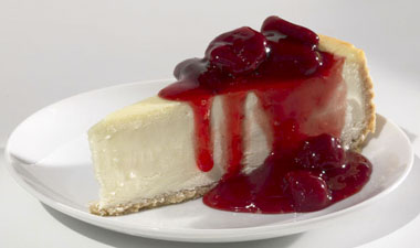
Picture #7 – Here, we’ve switched out the front strawberry on the plate (again…) and taken away the top far right berry. That top berry tended to take away the over-all iconic shape of the cheesecake. Sometimes, less is more.
One thing I forgot to mention earlier. The client was considering the option of outlining the cake off of the plate and not the plate off of the table. For that reason, we thought it might be a good idea of condensing the cluster of strawberries on the plate. Hopefully, this would keep the front lip of the plate from obscuring the anticipated pool of sauce on the plate. In this business, we try to think ahead.
I’ve been cropping in on all these examples so that I can make the images as big as possible for conversation’s sake. Because the files that my camera turns out are so large (over 100 meg RGB) I don’t worry all that much about maximizing the image in the frame. I usually shoot a little loose and then crop in as needed. For image #7, I didn’t crop in so that I could show you the grey card I use to check my color. One thing most new-be photographers don’t give a whole lot of thought to, is color. Luckily, food photography isn’t as picky about color as other types of photography. Rarely do you need to match PMS colors or anything like that. In the case of food photography, “warmer” is usually better than “cooler” and sometimes even better than “neutral”. One thing that is sometimes a problem is the difference in the color temperature between light sources. With this shot, I’m actually using three light sources: the main box, the big ten-inch scrape light, and the fill light. It’s usually important to keep all these light sources pretty close to the same color temperature. If they’re not, things can get a little weird. I could see using this as a tool some time in the future, but to tell you the truth, I haven’t experimented much with that yet. Any way… I use that little color chip to get me back to neutral. If you use one of these little chips for this purpose, you need to be really selective about where you put the thing. You don’t want it being contaminated my reflections of objects in the shot and you want it to be receiving the same light that the most important area of the subject is receiving.
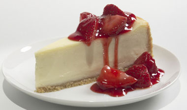
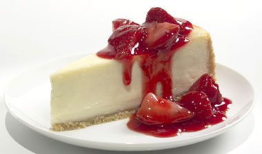
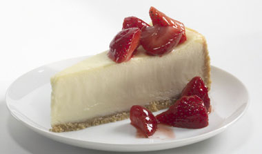
Picture #8 – Now we’re getting close. We’ve added the sauce and you can really see the importance of the glair card behind and above the cake. (look at the top left strawberry) Another advantage of the scrape light (mirror) is all the little highlights in the strawberries on the plate. I think that all these highlights really give that area some life. This is the first image since picture #2 that we’ve sent to the client. We needed approval on the number or strawberries and the specific placement of those berries. Notice how there are a couple of unplanned drips. We’ll have to work these into our final drip pattern, but that shouldn’t be a problem. They’re in good places. The client liked what they saw and it was time to do the drip.
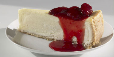
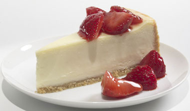
final shot
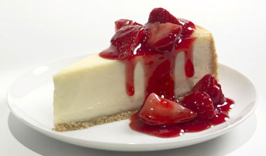
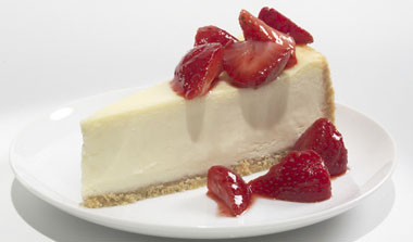
Shot #9 – Usually, with drip shots, it’s a good idea to keep going even after you have the one you think is the “final” shot. Ya just never know… You might just get something nice that you haven’t planned for. In this case, it didn’t happen. The second drip ended up giving the cake too much of a symmetrical look. Oh well… For the few extra moments that it took to shoot, it was worth a try.
favorite light source
How to build a mirror (coming soon)
Color correction tip (coming soon)
|