How to photograph food - Food photographyAbout the food photographer. I’ve been a professional photographer now for more years than I care to admit and for the last ten or so years, I’ve been specializing is food photography. I may not be the ultimate expert, but I’m as close as your going to get for free, here on the Internet. So you be the judge and learn what you can, and if you find yourself disagreeing with what you read here, tough… Ya get what ya pay for, or as my six year-old niece explained to me about the fair distribution of the toys at her daycare, “Ya get what ya get!”
|
|||||
Purpose of Food photographyI realize that the discussion of different types of photography may not really help you in learning how to photograph food, but it may answer a few questions regarding the profession of food photography. I’m attempting to cater to three different audiences here. I would like to help educate the budding student professional or high-schooler that is trying to figure out what they want to be when they grow up. I’d like to give them a little glimpse into a profession that not too many individuals know much about. I would think that the typical high school guidance counselor knows little about the typical day of a food photographer. The second type of viewer that I’m reaching out to, and most likely the largest audience of this article, is the advanced hobbyist photographer. Maybe their brother-in-law is offering them a few bucks to photograph his new restaurant menu or maybe they just want to expand their photographic skill set. For whatever reason, something inside drives them to learn more and more about this fascinating hobby of photography. Finally, the third type of viewer I expect to visit this site is the advanced professional. Because of this person, my competitor, I won’t be able to explain all my secrets. I’m not quite as dumb as I look! Hey…? To save you some time, I will try to point out areas that pertain to the profession of food photography and also those sections that relate to the technique of food photography. Food Photography as a ProfessionBasically, there are three main types of food photography: Packaging, Advertising, and Editorial. These are vague, abstract categories and you will always be able to find exceptions to the generalizations I’m about to make, but for discussion sake, here we go.
Packaging - Food photographyOf the three types of food photography, packaging tends to be the most technical, tedious, and anal-retentive type of food photography. It is not unusual in a packaging shoot to actually count the number of peas shown on the plate. Strict rules in advertising make everyone involved in the process. Lighting must be relatively flat to show maximum detail and there is definitely not room for special effects. Your job is to show the food in a realistic, favorable way. An Art Director and a layout will be supplied and you are expected to match that layout to the best of your ability. Most details of the shoot regarding cropping, propping, and backgrounds will be pre-determined. Your input and creativity will be put on the back burner. Most of the time at the shoot will be spent poking very small details and dropping images into layouts to see if everything fits just right. Please don’t get me wrong, it still beats “working for a living” but of all the types of food photography, this kind of work is the toughest. Advertising food photographyI’m using this category of food photography as a broad “catch all” category encompassing actual food ads, menus, product brochures, and possibly billboards. This type of food photography tends to be less tedious than packaging, but still can be quite restrictive because of layout parameters. Someone, usually an Art Director, or possibly a Designer, has a predetermined idea of what end result will look like. There is usually a layout, and everyone expects that the final photo to end up looking very close to the Artist’s illustration. There is usually some room for taking advantage of unforeseen opportunities such as props or lighting special effects, but the end result must communicate the idea behind the photograph. A pretty picture will sometimes take a lower propriety to communication. Editorial food photographyThis is the type of photography that most food photographers love the most. The most important thing is “making a beautiful image”. Instead of needing to communicate “Heinz’s hot, moist, meaty, abundant, corn fed ground meat stew”, you just need to make the viewer say “Wow!” This kind of shot usually makes “lighting” the big issue of the photo. Ya, it has to be well composed, and beautifully styled and nicely propped, but if the lighting isn’t spectacular, the shot ends up being just so-so. One of the greatest compliments I ever received was from a food stylist that said, “Mike, you can make a turd on a paper plate look good”. Now that’s high praise! The food photography teamAgain, this info is for those of you who want to know more about the profession of food photography. I’ll get around to actually giving you real tangible advice a little later. In the world of Professional food photography, the picture is created, not by an individual, but by a team. This team consists of the following personnel: Food photographer – The food photographer’s job is to make sure that the Client and the rest of the team are happy campers. Sometimes the experience of the shoot is as important as the actual photos that you end up producing. Theoretically, you are in charge! In reality, you are about fourth or fifth down on the chain of command. Basically, my main job as photographer, other that client relations (schmoozing), is to make the initial lens selection, determine depth of field, and to artistically apply the lighting. As the shoot goes on, the photographer’s job is to work with the team to refine the shot in such a way that as many team members as possible, end up happy with the final results. Of course there are members of the team whose opinions are more important than others, like the guy with the checkbook, for example.Other Food Photography Team members (I’ll try to expand on this someday) Photo assistant The food stylist The Prop Stylist The stylist’s assistant(s) The client The client’s client The client’s client’s boss The process of the shoot. (subject under construction) Different issues related to food photography Food Photography Technique Cropping – It’s kinda tough to discuss composition here. I’ve spent twenty or so years learning about composition and it seems to be one of those topics that don’t translate very well into words. Good composition is sort of like pornography. You know it when you see it. We could discuss things like shapes, tangents, compositional flow, balance, and all kinds of other high-faluten words, but they wouldn’t mean much. The trouble is that Art is so damn subjective. One man’s garbage is another’s Rembrandt. If you can list a bunch of compositional rules, I’ll take those same rules and show you how they’ve been successfully broken. Sometimes during the course of a photo shoot, I’ll make a stand and fight the rest of the team on a compositional issue, but not very often. Propping – The props or background in food photography can be a very important element of success. Not having the right prop can mean the difference between success and failure. The correct prop or background will help set the mood of the photograph. High key lighting with low-key props can be a recipe for confusion and disaster. Many times in a food photography shoot, the entire team isn’t happy with the shot and no one really knows why. In these cases, propping is usually the problem. The propping is the thread that ties everything together. The color, texture, and style of the props must complement the food for the “concept” of the photograph to make sense to the subconscious of the viewer. I know, it sounds a little weird, and it is… It’s all really subjective and on most shoots, not everyone ends up completely happy with the end results. As a matter of fact, I would venture to say that an all shoots, not everyone gets his or her way, but the important thing is that the end result be consistently excellent. You need to trust in the rest of your team members. If you don’t, you need to tweak the team so that the results are better and the working experience continues to be a pleasurable one for the majority of the team, or at least the client. Camera Angle – Many times the angle that the food is to be photographed from has been determined in advance by the layout artist or art director. He or she will usually have an illustration or sample photograph to show you what they expect you to produce. If not, I would suggest that you choose an angle somewhere between 10 degrees and 45 degrees above the table surface. You job as photographer is to make a two dimensional medium, (a photograph) as three dimensional as possible. If you shoot from directly above so that you can’t see the sides of the food, you eliminate one of the two dimensions left available to create the impression of three dimensions. Not a good idea. The lower angle you shoot from, the more height the food will appear to have. If you go too low though, you won’t be able to see the top of the food, thus eliminating another dimension. These suggestions here are only basic rules of thumb. Always remember, breaking the rules can sometimes be a fun and exciting thing. (I sure hope my daughter doesn’t read this…This never ever applies to doing your schoolwork or listening to you PARENTS!) Another factor in the decision of camera angle is that the lower you go, the better the food looks, but the more props you need to take up some of that vertical space created in the composition. Also, remember that the professional is attempting to fill up image space in such a way as to make the client happy. Food tends to be a horizontal subject matter, but sometimes the ad space you are trying to fill is vertical and sometimes there is copy (words) that you need to work into the composition. If you’re an amateur and just trying to make a pretty picture, you will probably find yourself taking mostly horizontal pictures from kitchen chair height. Focus – Along with lighting, focus tend to be a very trendy component of food photography. Limited focus usually produces a more “artsy” feel to the photo and is seldom used in packaging and often used in editorial food photography. Maximum focus is usually the technique of the packaging project. Of course, there are always exceptions. When limiting focus, make sure that you pick out the plane of focus with great care. Usually, you will want to select an angle of the food that is either at the very front of the plate or somewhere in the first third. Try to choose an area where there is something specific to look at. If there is a pea sitting on a field or rice, focus on the pea. Give the viewer something prominent to look at. I find that I either shoot almost wide open, or I shoot for max, depth of field. (usually wide open) Lighting Mood – Before you begin lighting a subject, you need to know which way you want to go, whether it’s high key, low key, or somewhere in between. You can always change your mind and go in another direction, but at some point, you have to begin in one direction or another. Most times, the mood of the shot will be determined by the art director or the leader of the project. Their printed piece will have a “look” that they are attempting to maintain. This look should be supported by not only the lighting, but also the propping, focus and composition. Shape – Probably be biggest decision a food photographer will make during the creation of a photograph, is where he will place the main light. Most novices will not realize how important in inch or two can be when positioning the main light. Remember! Your job is to make a two-dimensional object (the final image) look as three dimensional as humanly possible. One way you will do that is by lighting the object in such a way as to create as much shape and texture as possible. The placement of the main light is made to create shape. Is the main object being photographed most like a cube, a sphere, or a cylinder? There are “classical” ways that artists have used to illustrate these shapes for centuries and there is a good reason for that! You might want to consult a “how to draw” book at Borders next time you’re there. You’ll be amazed how much you can learn from drawing books. Your real challenge is not so much to learn how to light well, the real challenge is to learn how to “see light” and what it does to the world around you. The great thing is that you don’t need to be in a photo studio to learn this. You can study light anywhere you find yourself with a few extra moments to give a little thought to what’s sitting in front of your face. Another great way to learn how to light is to visit sites like the Black Book or the Work Book. These sites are advertising mediums for the best photographers in the world. Just for fun, try to figure out how they did the shots that you find yourself admiring. They don’t have to be food shots either, just really good shots. Good Lighting is good lighting… Where was the light placed? How big was the light? How many lights do you think they used? Was it the light that “made” the shot, or was it the shadow that made the shot great? LEARN TO SEE THE LIGHT. Then it will be easy to see the light on your shots too. Take a picture. Look at it. No, I mean REALLY look at it! Move the light, take another picture and compare it to the last one. (repeat as needed) You need to think in terms of learning to see the light, not in terms of making pictures. Pressing the shutter, does not a photographer make… Which is the most important surface of the main object? If you put the main light on that side, will the shadow obscure some other important object? Is that necessarily a bad thing? What if I raise the light a couple of inches? Will that change the shadow and make it worse or maybe better? What about if I move the light a little farther behind the subject? Does that give me a little more texture, or does it cause a glare on the surface? Texture - Do you want to emphasize or deemphasize the texture of the subject? I like to “scrape” the light down the side of a food item when I’m looking for maximum texture (which is most of the time) One inch can really make a difference when you’re trying to do this. I can’t tell you how many times I’ve had to reposition my lights and reflectors after the client has spun the plate just a fraction of an inch. In food photography, inches really do matter. And bigger is not always better, either… Another issue that is much more important than most photographer realize is light source size. Boxes are more forgiving, and they’re a lot less textural too. There is a rule of thumb in food photography and photography in general. The bigger the light source, the less texture you will end up with. If you’re shooting people, texture usually isn’t your friend. That’s why so many people shooters use large umbrellas and boxes. In food photography, texture is your friend, your desire and ambition. In food photography, small light sources are a good thing. With all good things, there are drawbacks. When you have small light sources that produce beautiful texture, you also get very crisp cast shadows. Sometimes these shadows are unsightly and unwanted. You will need to experiment with various fill techniques to alleviate these downsides. Believe me though; the advantages of small light sources far outweigh the disadvantages when it comes to food photography and creating texture. Having said that, if you live in Pittsburgh and you make a living photographing food, I strongly recommend that you use the largest light box possible! Some food objects have a characteristic that make its texture somewhat unique in the world of photography. Most things we are asked to shoot are opaque objects, but when it comes to food photography, many of our subjects offer us an interesting alternative way of showing texture. Some of the things we are asked to shoot are translucent. The translucent leaves of a salad can show the interesting texture we so desire to create, even more spectacularly than “scrapping light” can produce. Keep your eyes peeled for opportunities like this. Take your time and look to see what each food subject offers in the way of uniqueness. Is there a way to create something special from this particular subject that other subjects do not offer. Just think to yourself that this photo will only be good if you can somehow figure out a way to make it “special." Food has different types of reflective qualities. Maybe it’s the sheen of the food that will make it special? It’s all in the light. It can be bland and boring, or it can be spectacular, depending on the lighting. It’s up to you. Types / brand names of equipment – Sure I have personal preferences when it comes to equipment, but there are plenty of good photographers (much better than I am) that don’t use my preferred equipment. It’s sort of like asking a mechanic what type of wrench he prefers. He’ll tell you, but if you ask him if he could do the same job with another brand, he’d answer in the affirmative. Don’t get hung up on the hardware. It’s all about what you do with it. Having said that, I prefer to use a view camera to shoot food. It gives me a few more focus options to work with, but I have some very good competitors that do not use a view camera for their food work. (and I hope they never do… :-) |
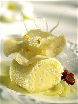
This is a good example of using a small light source. You can see the cast shadow on the left of the plate made from the main light. Do you find it distracting? Do you think that a large light source could create the same degree of texture? Take a look at the two shadows cast across the upper right of the background. No matter how hard you try, can't do that with a large light source. Also, notice the highlight area on the lower left hand side of the food item. By using a small mirror reflected back from the main light, I was able to light only the lower half of the item, enhancing the appearance of depth. Also, the texture of the white dish is enhanced by the use of the small light source. The minimum depth of field was chosen to isolate the viewer's attention. I think it worked. You?
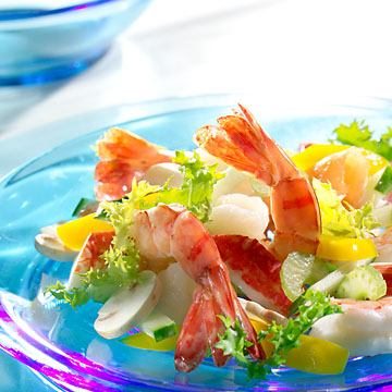
Please note the direction of the main light. You can see it by looking at the bowl in the upper left of frame. Not from the front, is it? This image is a really good example of the magic that small light sources and translucency can cause. Take a look at the lettuce leaf and shrimp tail. Besides the neat translucency, backlighting causes increased texture and rim light effects. Rim lighting helps to create that third dimension we photographers strive so hard to create. Also note the light ratio. The front surfaces are intentionally under lit (compared to the rear main light) to enhance the appearance of depth.
Food Photography Portfolio by Michael Ray
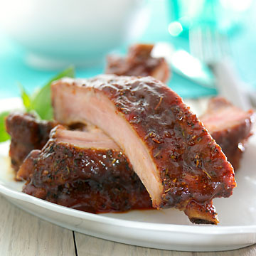
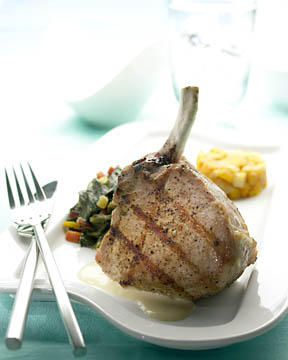
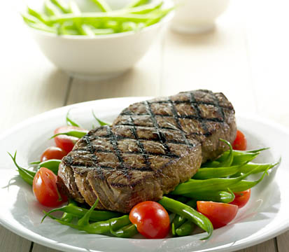
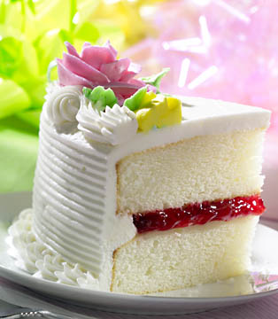
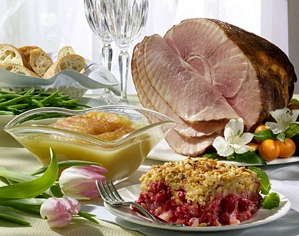
Ok, I don't always use small light sources. As a matter of fact, this is probably my all time favorite image. Remember what I said about breaking the rules? Here ya go... Another example of large and small light sources in the same shot. Notice the graduation of tone across the meat? Adds a little interest, doesn't it? Also, check out the reflection on the plate from the large backlight. It's a nice technique and I use it often. You want sheen, but not too much on surfaces like this. If there is no sheen at all, the steak looks dry, too much and can't see the dang food. You need to work as a team with the stylist to come up with the quality wants. Sometimes the sheen might be the stylist's fault, but more times that not, it's the lighting. Yet again, a small light source. Which way is the main light coming in from? See how the tip of the slice is becoming transparent? See the little spectacular highlights on the filling of the cake? See how the form of the icing rose is in shadow? Shows a lot of dimension , doesn't it? What do you think that this shot would look like if I would of placed the main light beside the lens, like most novices would have? This is an example of an Advertising image. Notice how all the products are in focus. This usually isn't the case with Editorial work. Most brochure designers need to sell several products at one time. Quick quiz... Large or small light source? From behind or in front? Did I use any mirrors? How about cast shadows? What shape are the beans? What is the typical way to light that particular shape? Is the light ratio relatively high, or low? Of all the products in the shot, what one item dictated the direction of the main light? Ok, you pass.
Again another example of translucency and rear light.
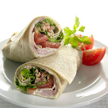
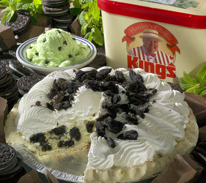
Remember when I talked about lighting for shape? What shape are these food items? Again a large light source, right? Yes and no. The large rear light creates some really cool reflections on the plate (I use this technique all the time), but is that the only light source that I used? I'll never tell... There's a lot of texture in the front of that wrap, not a large light source thing, is it? Look at the translucency of the tomato. Sort of adds dimention, hey? Look at all the texture on the top of the pie! How did I light the inside of the pie? Do you think that the slight cast shadow across the front surface of the ice cream box adds any dimension? Any of those leaves appear transparent? Small light source? Remember, the key to getting better as a photographer, is to learn to see the light. You do that by observing images and experimenting. Ok, now it's your turn. Go for it!
|
||||
Rules of thumb in food photographyUse a smaller light source than you feel comfortable with. Larger light sources are more forgiving and easier to use. They also create very little texture on your subject. Smaller is better! Keep the light lower than you think you should. Low lights create more texture on the top surface of moist food items. Too many food photographers keep their main light so high that they don’t get as much texture as they could. They do this, mostly out of habit and because the cast shadows from high light sources are less distracting. What they don’t realize is that shadows can also be “interesting” too. I read on some forum somewhere that it’s not the light that makes most photographs beautiful, but the shadows that make the shot. I whole-heartedly agree. The Steelers are the best (self explanatory) Use more mirrors than you think you should. Mirrors are like little baby “main lights” whose shadows can be hidden. If I don’t have a hundred little mirrors lying around my studio, I don’t have a one. Mirrors are great things. You can either make them in all shapes and sizes or tape them off to the shapes you need at the time. There are times you need the light to be long and thin and there are other times when you can use a circular mirror. I love mirrors. Use less overall fill light than you think you should. One mistake many photographers make is to use more fill light than they need. The rule of thumb is that the less fill light, the more drama and texture your end up with. You can go too far though. Very seldom do I see a successful food photograph with black areas in it. Black food is usually a no-no. Keep the main light as far back as you can without creating too much glare of the food surface. Most amateurs light from the front. You can’t get too much texture from lighting from the front. Don’t light from the front. Did I mention lighting from the front? Don’t. Use either a really short or really long lens. Unusual perspectives are interesting. My wife is always right, and I seldom am. You married? Enough said… |
|||||
|
Didn't find what you're looking for? |
|||||

