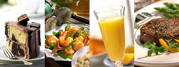
In my opinion, one of the toughest things to do in food photography and professional photography is to translate the client’s words into the photographic medium. For example, “I want this to look like it’s 7:00AM on a Sunday morning in the month of April.” Or a client might say, “I want this shot moodier”, or they might say, “I want the lighting to be more FUN.” No kidding… I’ve actually had clients say stuff like that to me! And not just once, either, it happens all the time. The assistants and stylist that I work with all find this to be hilarious, but for the guy that has to translate these swords into lighting, it’s sometimes far from amusing.
I’ll do you guys a favor and tell you what I’ve learned in the way of translating the language or “Art Director” into the medium of “food photography”. Since there is no standard to refer to regarding the language of “Art Director”, the definitions that I am about to give you may vary form region-to-region, or even from Art Director to Art Director. For now, here is one term and it’s meaning.
Morning light – I get this one all the time, and I’m still not sure what the heck it really means, but the clients keep coming back, so I guess I’m doing something right. If you think about it, what is the difference between light in the morning and light from other times of day? Well, I guess the first obvious difference is the fact that in the morning, the sun is low on the horizon, right? One problem… Isn’t the sun low on the horizon in the late afternoon too? In my part of the country it is.
What is the difference then between morning and late afternoon light then? It’s really a stretch, but this is what I came up with. I think that is has to do with diffusion and color temperature. Even though the sun’s color temperature is the same when it strikes the earth at the same angle in morning and in evening, there are a couple of other factors that become introduced that could possibly make the difference, at lease in the subconscious of the average Art Director. The only two factors I can possibly think of are fog and sleep. I know it sounds weird, and it is, really, but listen to my argument and see if it doesn’t make at least a little sense.
Fog happens much more often in the mornings and it tends to “soften” the sunlight streaming through it. The fog also tends to “whiten” the light (don’t ask me how) where as, afternoon light seems to be “warmer” or oranger, right? Translation… Morning light is “cooler” and “softer” than evening light, meaning you would use a low, relatively large light source, with maybe a very slight blue filter either over the light source to cool things off a it.
Sleep – Ok, maybe sleep isn’t the right term, but hear me out and see what you think. When you wake up in the morning, and the bedroom window is open, what is the affect? Right after you curse yourself for drinking too much the night before, what is your reaction? Damn, it’s bright in here! It’s really not any brighter than afternoon light, but because your pupils were dilated from sleeping, everything seems a little brighter than normal. Translation… Over expose a little, or maybe be a little selective in the props that you select. Choose “lighter” colored props and it may help reinforce the “morning” feel. You might want to “backlight” the subject a little more to reproduce the “streaming in the window” feel too.
So class, what did the crazy guy come up with? In Art Directorize, morning light means, “Use a blue, large, rear, low light and over expose a little.”
Good luck.
Comments welcome: blogmebaby@foodportfolio.com - food photography portfolio
11/16/04
Food Photography Art Direction via email
Over the last couple of years, I’ve seen an increase in Art Direction via email. Part of me thinks that this is a curse and part of me thinks that this may be the answer to a dream, a curse and a blessing.
Especially in the world of food photography, waiting for an “OK” from some Art Director in some meeting a hundred miles away, is not an option. Things move, things change, things start to curl, dry out, and basically, start to go to hell. Like it or not, Art Direction by email is here to stay. If it’s not the actual Art Director that isn’t at the shoot, it’s the client that has to see the image before we move on. I can’t begin to add up much time I’ve wasted sitting around waiting for some distant “big wig” to give their approval of some food shot.
Part of me hates it and part of me loves it. The reason that I like this whole idea, is that it opens doors that may never have been opened before. Tell me, if the art Director isn’t at the shoot anyway, why does she have to be a client that is only five miles away? Why not a client 1500 miles away? Why does she have to even be in the same hemisphere? See what I mean? Now, we can open up our client base to the entire freaking world. If the client is only an email away, the world is our market. (at least the part of the world that is at work at the same time as you are) We’re no longer geographically bound by how far the client is willing to travel. We’re not quite there year, but I think that it’s coming. As clients become more and more comfortable with the idea, the more we can count on finding new clients from distant areas. Why can’t I work for food magazines in New York, when I live in Pittsburgh? But don’t forget the flip side of that. Maybe that client that you count on right now, will find someone else (me, I hope) to do their food photography.
Another great thing about having the Art Direct, or “OK” person, not at the actual shoot, the photographer will have greater flexibility in displaying his or her creative vision. Too often an overbearing Art Director stifles the photographer’s vision, right at the very beginning of the shoot. If there is no Art Director and the shot actually “gets going” before the first set of approvals, the Photographer has a better chance of getting his initial vision made into reality. Then again, the down side is that all the time before the first approval, will be wasted.
So let this be a warning to you. Things, like always, are changing. You can change with them or fight the change. Maybe it’s time to geographically expand your marketing efforts, or maybe it’s time to hunt down those few clients that don’t want to change either. The choice is yours
Like I said, is it a blessing or a curse, problem or opportunity? You can be the judge…
Comments welcome: blogmebaby@foodportfolio.com - food photography portfolio
11/15/04
'True' fill light in food photography (and all other photography)
Ok, this is more of a technical subject, but I think that it’s worth the electrons as a topic of discussion. Pretty much every photographer understands lighting enough to know the concepts of main light and fill light.
The main light gives the subject, whether it food or people, shape and form. Probably the biggest decision is lighting a subject is deciding where to optimally place the main light. On some subjects, an inch left or right, or up and down, can make or break the shot. Don’t get me wrong, on many shots, and inch or two in the light’s position, does not make much of a difference, but in some shots, especially food photography, an inch can make a huge difference in the quality of the photograph. We’ll talk more about that at another time.
The other, lesser thought of light source, is the fill light. When most photographers set up their lights, they will place the main light to one or another side of the subject and the fill light will usually be placed very near the camera, most likely on the opposite side of the camera as the main light. The idea being that the fill light is meant to “fill’ in the shadow of the main light. The intensity of the fill light is increased or decreased to give the subject matter the desired “light ratio”. Right? That’s right. The problem is that the fill light that is meant to ONLY fill the shadows, but in reality, it ends up casting it’s own shadow and there are usually large areas of the image that the fill light never reaches. Don’t believe me? Try shutting off you main light and take a picture using just your fill light. You will notice that the fill light doesn’t really fill, especially areas “under” the subject. If the subject has any type of overhang, like a plate lip, for example, that shadow area ends up being in shadow from both the main light and the fill light, making it totally “un lit”.
Ideally, the fill light should surround the camera, theoretically, casting light from below, above, and from both sides of the camera “filling” in everything and not casting any shadows of its own. The ideal light would probably be a really big “ring light”, but in reality, most ring lights are too small and end up casting their own shadows. In food photography, you can see the lack of fill light in a very textured subjects like a salad, for example. Each leaf of the salad acts as a little awning, preventing the main light and the fill light (any light from above the camera axis) from actually getting to the shadow areas. The result is very very dark shadows. What’s the solution? Glad you asked…
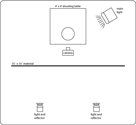
Years ago, I bought a 10’ x 10’ sheet of material from Chimera, the company that makes the light boxes. The material is the same material that my light boxes are made from, so in theory anyway, the light that I transmit trough the material is the same color temperature as my light boxes. I hang the material directly behind my camera and project two lights from behind and trough the material. The lights are far enough apart from each other so that the hanging material works as a 10’ x 10’ light box. The big advantage of the is light is that some light ends up coming from below, above, and around the camera, making it a “true” fill light. The camera and food photographer does obstruct some of the light, but a portion of the light does und up coming from slightly below camera axis, filling in any “awning” areas in your photo. It really makes a difference. Try it yourself.

11/11/04 - Happy Birthday Angela!
Bigger is not always better…
You know what they say, it’s not the size of the wave, it’s the motion of the ocean. This concept not only applies to lesser endowed males, but also to food photography lighting.
|
 |
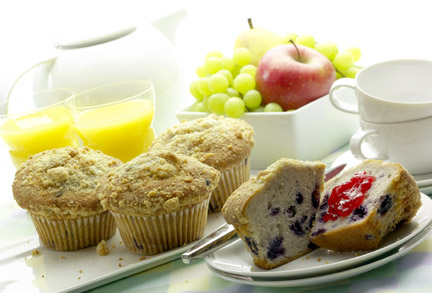
When it comes to source size for lightning food, or any type of a photographic subject, bigger is not always better. The advantage to using larger light sources is that it tends to be a little safer, more forgiving and easier to use. Bigger light sources tend to make softer shadows and a more gradual conversion form “in light” to “in shadow” across the subject matter, which sometimes is more appealing than the contrasty look created by a larger light source. (follow that?) The big disadvantage in using larger light sources is that the larger the source, the less texture it tends to create. The smaller light source tends to create itty bitty shadows across a surface, where the larger source tends to automatically fill in the shadows. The best way to create texture in the studio is to “scrape” light across the desired surface. The smaller the light, the more texture you end up with. (given the same amount of fill) The more texture you get, the more drama you create.
(tangent subject – one of the tough things you will find in professional photography is translating your clients words into the photographic image. Drama is one of those words. Drama usually translates to using a small light, without much fill light, and at a harsh angle so that much of the subject is in shadow.)
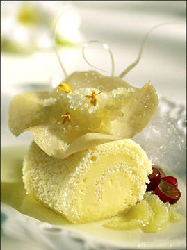
Another nice thing about using small lights, is that you can intentionally cast shadows across the image (as in the background of the image supplied above.)
The down side to using small light sources, is the really crisp shadows that the small light casts onto the surface you are shooting on or across some of the other objects in the picture. The cast shadows across other objects can be avoided by adjusting the composition or by possible selecting another position for the light. With a little experimentation, you will find that these shadows can be minimized by using reflectors (or mirrors) to bounce light into just the shadow areas.
So… if your goal is to create as much texture as possible, try using a small light source in place of the big freaken box you usually use. And if you screw up and your client hates it, give them my number. : )
Comments welcome: blogmebaby@foodportfolio.com - food photography portfolio
11/10/04
Future Food Photography Blog subjects
I figure that I need to give this blog a little kick start because it’s so new.
I’ve made a list of subjects that I plan on writing about. Maybe this will entice you to return once in a while to partake of my thoughts and ideas:
What is “true” fill light? How to use mirrors., light source size, low light magic., What does a food stylist do?, three elements to a photograph, learn to see light, the evolution of a lighter, the prop influence, why digital is better, SEO, the view camera explained, why most photographers are men, a photographer’s style is based on their equipment, pushing the envelope, the value of experience, Art direction by email, promotional ideas, how to get better, styles of art direction, client relationships, dappling, you need a dummy, kite, morning light, my kitchen table, light control, rear light , color temperature, grill gells, lighting silverware, studio size and style, lighting in layers, studio equipment, lighting equipment, how to light food, which lens & why, why food photography, how to light high key, how to light low key, focus manipulation, sheen of stuff.
Comments welcome: blogmebaby@foodportfolio.com - food photography portfolio
11/09/04
What makes one photographer better than another? (part 1)
I have this theory… I think that all photographers (food, commercial, whatever) are on this “ladder of understanding”. Take me for example. I’m certainly not the worst photographer around, but I wouldn’t consider myself the absolute best either. There are many photographers’ work that I admire and frankly, that I envy. I believe that each photographer, from his own step on the ladder, can see what separates himself from other photographers that are on lower steps. In other words… When I look at the work of a “worse” photographer than myself. I can see immediately what makes him “not as good” as me. On the other hand, when I look at a photographer’s work that is better than mine, I have no freaking clue, why he is better. I know that there is something, but I can’t quite put my finger on it. If I could figure out why, I guess that I would make the changes in my work that would enable me to bring the quality up to the higher level. I call this phenomenon, “The ladder of understanding”. You can clearly see down an unlimited number of steps, but ya can’t see up a single damn step. I think this ladder of understanding applies to all types of art, photography, food styling, whatever…
Comments welcome: blogmebaby@foodportfolio.com - food photography portfolio
Other Photography articles of interest to novice photographers, by Michael Ray:
How to become a professional Photographer
Basic Photographic Lighting
Photographic Lights
Photographic Portfolios
|
Links Of Interest:
Food Photography portfolio - food photography portfolio of Michael Ray
Food Stylist Directory
International Association of Culinary Professionals
Food On Film - Food styling and photography seminar
Food Designs - Food Stylist resource
Mandy.com - International film and TV productin resources
Trengove Studios - props and special effects
Forum Links
PDN - Photo District News, professional photography
Style Share - Food Stylist Forum
FM Forums - Photography
Photo.net - Photography
Gob Galbraith - Photography
Google Optimization - S.E.O.
Web Food Pros - Food Styling Forum
Link Exchange:
Pittsburgh Creative Directory of Advertising Agencies and Graphic Design, and Public Relations Firms
Pittsburgh People Photography
Image Fx - Digital image enhancement
Want to trade Links?
Photography Blogs:
Photoblogs.org
These images are from Michael's portfolio. Click on any one of them to take you to see his on-line food photography portfolio
|

