Different types of food photography assignments
Catalogs are usually among my least favorite types of assignments and the rare food photography catalog isn’t really the exception, but this assignment is a little different.
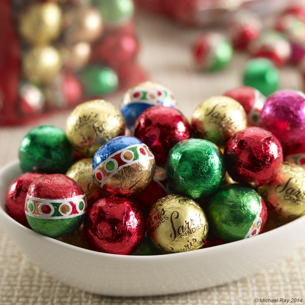
Usually, catalogs are translating some artist’s drawing into a photo, giving the photographer little freedom and less opportunity for creativity. This food photography catalog assignment is different. The company is giving me a great amount of freedom. It’s sort of like being given a bunch of sexy looking food and a stylist and being to make some portfolio pieces. It’s a dream job and I’m having a blast. I’ll post some more images shortly, since we have a whole week to go on this project and we have yet to photograph the covers, so I’m hoping to do some really nice pictures for that too.
The client asked me yesterday, “what food do you like photographing best?” Well, the truth is that the actual food in front of the camera isn’t all that important to me. Sure, some food is sexier than other food. Lobsters are prettier than re-fried beans and therefore usually make more attractive photos, but I usually don’t really care what I’m shooting. I do prefer to shoot in environments though, as opposed to shoot “outlined” shots on white. And I usually prefer to shoot in my studio and not on location, but I’m getting over that a little. I guess I’m a little bit of a control freak when it comes to my food photography. In my studio, I know I have everything I need somewhere close by. If I need another light box or a different shooting surface, I have things to choose from. On location, it’s not “if” you don’t have something you’d prefer to have, but “what” did you forget or what would you like to have that you don’t… But like I said, I’m getting beyond that and trying to embrace location food photography, and I’m getting more and more of those assignments. Which is cool! More candy photos to come!
Things I like about this food photo:
I like the bright and airy feel of the photo and the warmth of it too… The colors all work and since this is a food photography catalog, I had to shoot a hint of the packaging in the background, which isn’t ideal, but it didn’t detract all that much. I think the focus treatment really helps the photo too
What I don’t like about this food photo:
Not much… :o)


