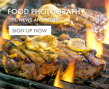
The funny thing about food photography and critiquing food photography is that you usually have no idea about the real reason for which the photo was created. This food photo is a good example. This was done for a sign that had one of those huge colored circles with the price of the product, printed on it, just left of center. As a food photographer, it’s an interesting challenge to create a beautiful photo and still leave room in the composition for weird elements like price tags. I think that this food photo worked well despite the price tag…


