Food Photos for a Happy Easter!
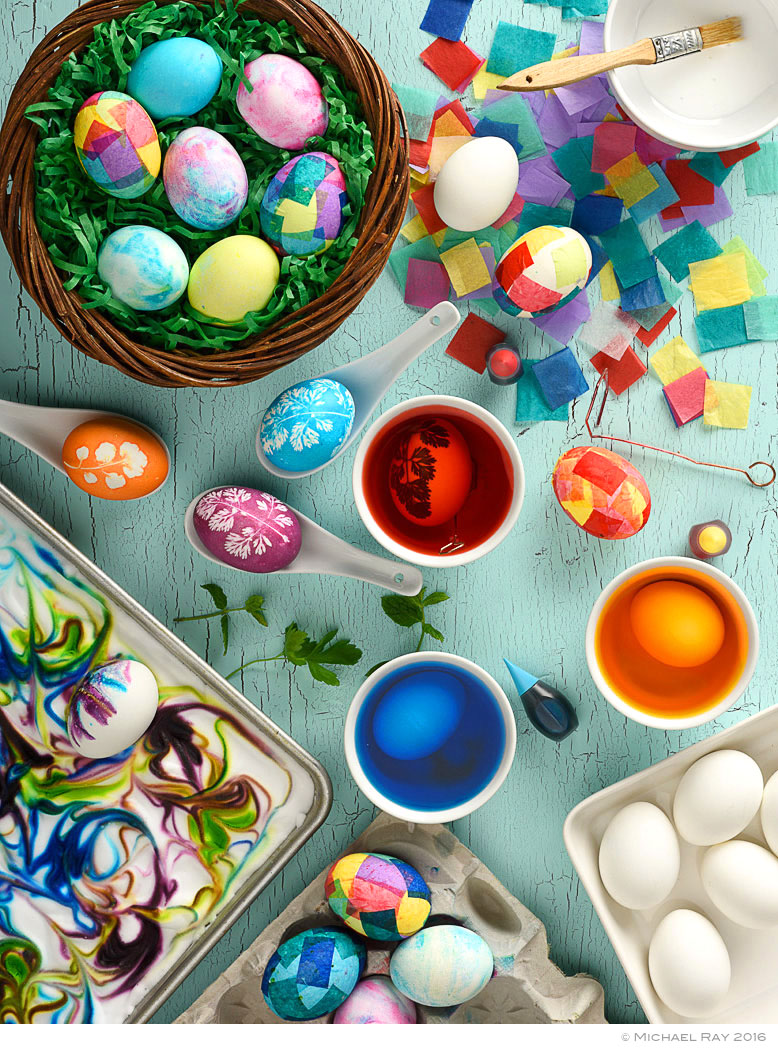
Lighting – The lighting on this food photo is pretty simple and isn’t what makes the picture special. The set is basically lit from both sides, with one side stronger than the other. They key with this lighting is to keep the light fixtures low. There is some fill from above, but the majority of the light is raked across the set in order to give as much shape to the food as possible. I would of placed a large box directly over the set, but it would of given me a reflection in the colored water.
Background – The background is very important to this food shot. The color is appropriate and tends to enforce the message the Art Director was trying to convey. The crackle and distress of the paint adds texture and interest too.
Composition – The photo’s composition is nice and surely doesn’t hurt the success of the photo. The image is balanced the there are no glaring compositionel “no-nos”…
Styling – The food stylist is what really made this shot what it is. I’d really like to take more credit, but I can’t. AnneMarie Leyden did an amazing job or prepping the eggs and props. My hat’s off to her.
So the moral of the food photo story is that the final image is the sum total of many components. Some photos are successful because of the lighting, some because of the props or the background. And others are successful or “good” because of all sorts of reasons, but to have a truly great photo, the food photographer needs to make as many of these elements a good as possible. The more elements that are good, the better the photo.


