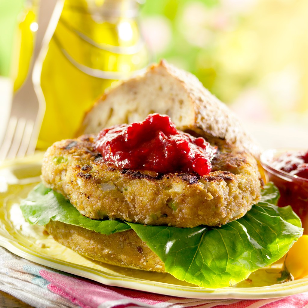
This is of my favorite photos and a good example of how a napkin works well in a totally supportive role. At a quick glance, you don’t even notice it. It doesn’t stick out or grab attention. It’s just there and it looks like it belongs.
Napkinology – The Art of Napkin Usage in Food Photography
I may not be the supreme expert on the art of napkin folding for food photography purposes, but I have been exposed to the subject for quite a few years now, so I thought I’d take the time to share some of the things I’ve learned about the subject. In fact, it’s sort of my new hobby…
In food photography, there are basically three purposes that napkins serve.
- Help Fill Compositional Holes
- Add Feeling To The Environment / Mood
- Soften The Shot
1. Help Fill Compositional Holes
The napkin is not the hero of the shot. (Unless your client is selling napkins and wants to sell napkins with your photos)
If you’re like me and you really enjoy folding and placing napkins in the shot, you need to realize that the napkin is not THE reason for the photo. It’s simply a supporting element. Sure, a well placed napkin can make or break a photo, but it’s never the reason for the photo. The food is the hero of the photo and the napkin simply has to add a “little something.” If you understand that, you’ll be well on your way to making great / useful food photos. In fact, if you see a food photo you really like and the napkin doesn’t jump out at you, then you know that the size, fold, color, shape and placement of the napkin use was perfect.
Classic Placement of the Napkins in Food Photography
There are a few obvious and classic places to use napkins in your food photos, under the plate, under the silverware, under a glass, as runner in background, and on a stack or plates.
Under The Plate
* Front side crop / bleed
I like to shoot from a pretty low angle and the front edge of the plate often times bumps up against the edge of the frame of the photo. This creates two semi-triangular areas on either side of the front of the plate. If I have a napkin under the plate, with a point of the napkin facing the camera, I can usually work that napkin into at least one of these areas, making the shot a little more interesting. I try not to get the exact amount of napkin to show on both sides of the plate because the symmetry looks odd. Unevenness usually works better. Another thing to play with is to not fold the napkin perfectly over on itself. This overlap will create another line leading into the plate, and that makes the image more asymmetrical, and a little more interesting.
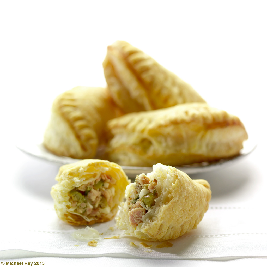
One mistake too many food photographers make is to make the napkin totally flat on the table. In doing so, the impression created is either of something fake or of stiffness. Having a little ripple in the napkin adds to the realism and informality of the photo.
* Perpendicular vs diagonal
I used to work with a particular stylist that loved to place the napkin under the plate so that the bottom of the napkin was parallel to the bottom of the frame. I hated this and still do, for some strange reason. I much prefer to have a little “diagonal” something going on with the napkin. To me, it adds a little motion and flow to the composition. His way wasn’t wrong and my way isn’t right. I’ve seen great food photos with the napkin both ways. You need to be aware, however, that your personal preferences will be looked upon as a style by some people and a rut by others. Both observations are true. Just try to be open to new and interesting ideas and unusual ways of doing things. There will be times that you want to do something really weird, just because you’re sick and tired to doing them the same old way. I think that’s a good thing. Experiment every chance you get.
* Centered vs off-centered
Similar issues present themselves with the decision to either center the napkin under the plate, or have it slightly off center. I fall into the “Almost Centered” camp. If the plate is teetering off the edge of the napkin “too much”, it sort of gives me the subconscious ebe-ge-bees… That’s just me. You might be okay with hot food on our lap. Everyone is different.
Under Silverware
Under the silverware is probably the most common place to find a napkin in real life, so of course that’s a good place to put it in your food photography. If you do decide to use it there, you’ll be faced with another bunch of decisions. Should any of the utensils extend beyond the napkin? Should the napkin be hidden by the plate at all, and if yes, how much? Should the napkin run parallel to the edge of the frame? There are no rights or wrongs to any of these questions. There’s just issues to consider in your never ending study of napkinology.
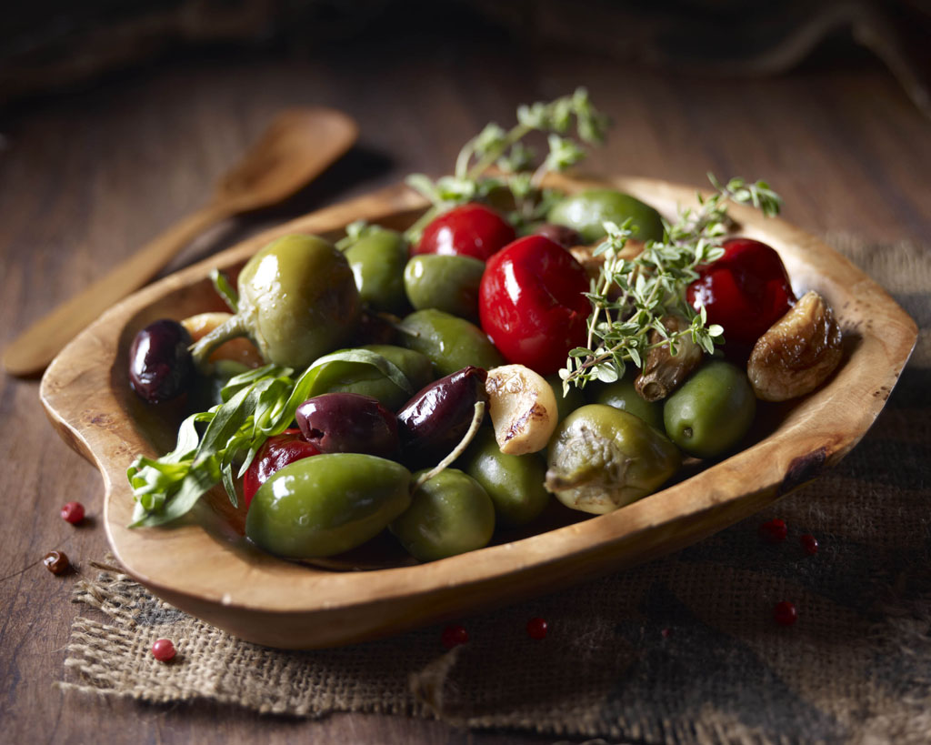
Ya, I realize it’s not a napkin… :o) But if kinda functions like one here… The coarseness of the texture, color of the burlap, and the positioning, all add to the “old world” feel of this photo. It belongs…
Under Glasses
If you’re going to place a napkin under a glass, it should probably either be a square napkin or there should be something else on the napkin, besides the glass. It only makes sense. The normal fold of a napkin makes it a strong rectangle and the base of a glass is usual a circle. You’ll remember from preschool that a circle really doesn’t fit into a big long rectangle very well. You get the idea, and there may be occasions when this doesn’t apply, but more times that not, it will. Remember, it’s art and breaking the rules is half the fun.
As a Runner
Some photographers and stylist try to use napkins as runners, bleeding off the top of the frame of the photo. In theory it’s a good idea.. but in my experience, this seldom works. It breaks up an area in the background of the photo with a field of color, usually with a bread basket or something on top of it, but I don’t find it works very often. Every once in a while it does, and I keep trying to make it work. More times than not though, it doesn’t. But I still feel it’s worth the effort of trying. I’ll do anything to come up with something “different”.
Scrunched Up Beside
For me, this is the toughest thing to make look natural, but if it works, it REALLY looks good. I guess that my mother never really scrunched up her napkins when I was a kid. Ya, that’s probably it… Anyway… There’s something really nice about the graceful long natural folds you can get when you scrunch the napkin along the side and back of the plate. I guess that the idea is to make it look like the plate was hot or messy, and whomever moved it onto that surface, needed to use a napkin to keep from being burned or getting messy. Then, they just sort of left it there. That’s the why, and if you can pull it off, it looks great! I usually have troubles making it look natural for some reason. I usually find a fold in it that is too sharp or seems to go at an odd angle. I struggle with this, but like I said, when it works, it really can make a shot look really cool.
On Stack Of Plates
I’m not a real fan of this technique, but I’ve done it on occasion. I will sometimes put a napkin on a stack of plates in the background of a shot just to fill space, but I find that unless you put a bunch of forks on the napkin, it usually doesn’t look right to me. I guess that when it’s out of focus in the background, you really can’t tell what’s going on anyway. When you put the forks there, it sort of explains itself. I think what happens is that the lone napkin almost looks like a design in the plate surface and it needs the forks to distinguish what it really is. That’s my theory anyway.
Watch out for corners and tangents
One thing I want to warn you about when placing a napkin. It’s real easy to create tangents with other elements in the photo, like a glass or breadbasket. You probably want to avoid this is you can. If you’re not careful, another thing that happens is that you end up with a little triangle of color (from the napkin) showing itself behind the plate. That looks a little distracting and visually, you usually figure out where’s it’s coming from. I find it’s better to avoid this if by simply folding that napkin corner under the plate or tuck it under itself, and tape it down.
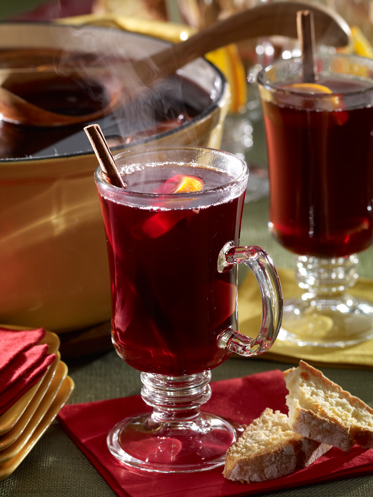
I think that in this shot, the napkins add to the mood and feel of the photo. They also do a good job of taking up some strategic space in the foreground of the photo. I find that the napkins on the plates to the left, are a bit distracting. (all in hind-sight)
2. Add Feeling To The Environment / Mood
Appropriateness
Not too many people choose to bring out the “good” paper napkins for Christmas dinner. Personally, I probably wouldn’t care, but if my wife saw a photo of Christmas dinner, and the table was set with paper napkins, she would notice it in a second. The napkins have to be appropriate to the shot and they must support the feel and mood you’re trying to communicate. If you’re illustrating a “tailgating party”, then sure, the paper napkins would be perfect.
Texture / color
The napkin should match the tablecloth, or at least it shouldn’t clash. We usually try to think about when the photo will appear in print. Browns, and oranges represent what season? Red checks represent what time of year to you? What about the colors red and green? White tablecloths and napkins mean something to you subconsciously. You get the idea.
Patterns
I try to stay away from loud patterns in my selection of napkins. I usually find them to be too distracting, but I’ve worked with some very talented Art Directors, that helped to create so very nice food photos, using patterned napkins. Again, there’s no rights of wrongs.
Let me mention something here… It’s usually a good idea to steam or iron the napkins before you put them into the set. You don’t want any weird dents of wrinkles and sometimes you won’t notice them until the food is on the set, and then it’s almost too late. You can lessen the chances of this happening by flattening those suckers before they hit the set. And you might want to press them again after you finally figured out what you want to do with them. If you’re like me, you’ve probably tried folding them a million ways before you finally decide on the final way. In the mean time, you’ve probably made dent or crease that you don’t want to show.
There may be times though, when a wrinkled up napkin is exactly what you do want, to help create a particular “look”. I’m never personally needed a wrinkled napkin, but it may happen some day. You just never know. I do like subtle waves in some of my napkins, but never a “dent”. This brings me back to the issue that there is no right or wrong to photography, but there is such a thing as getting hired again and not getting hired again… I prefer to iron my napkins. It’s safer.
3. Soften The Shot
This is a subject that you might be a little skeptical about and it’s hard to describe. Having “folded material” in a photo, when everything else in the shot is made of sharp metal, hard wood, and cold plates, brings a feeling of softness. It may not be a major factor in the success of the photograph, but if I have a choice, I’ll almost always try to get a napkin in there somewhere. I do think it brings in some texture and maybe some more gentle lines to the composition. It adds a little something that is just hard to put your finger on, but it does make a difference.
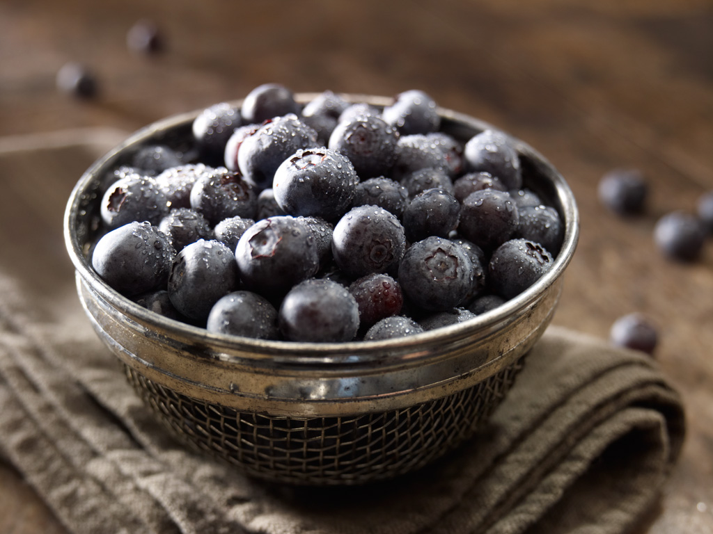
I love this napkin! The color helped with the monochromatic look of this photo. I also love that the napkin is so thick, almost too thick. The fold and texture work as well to give this shot a rustic feel.
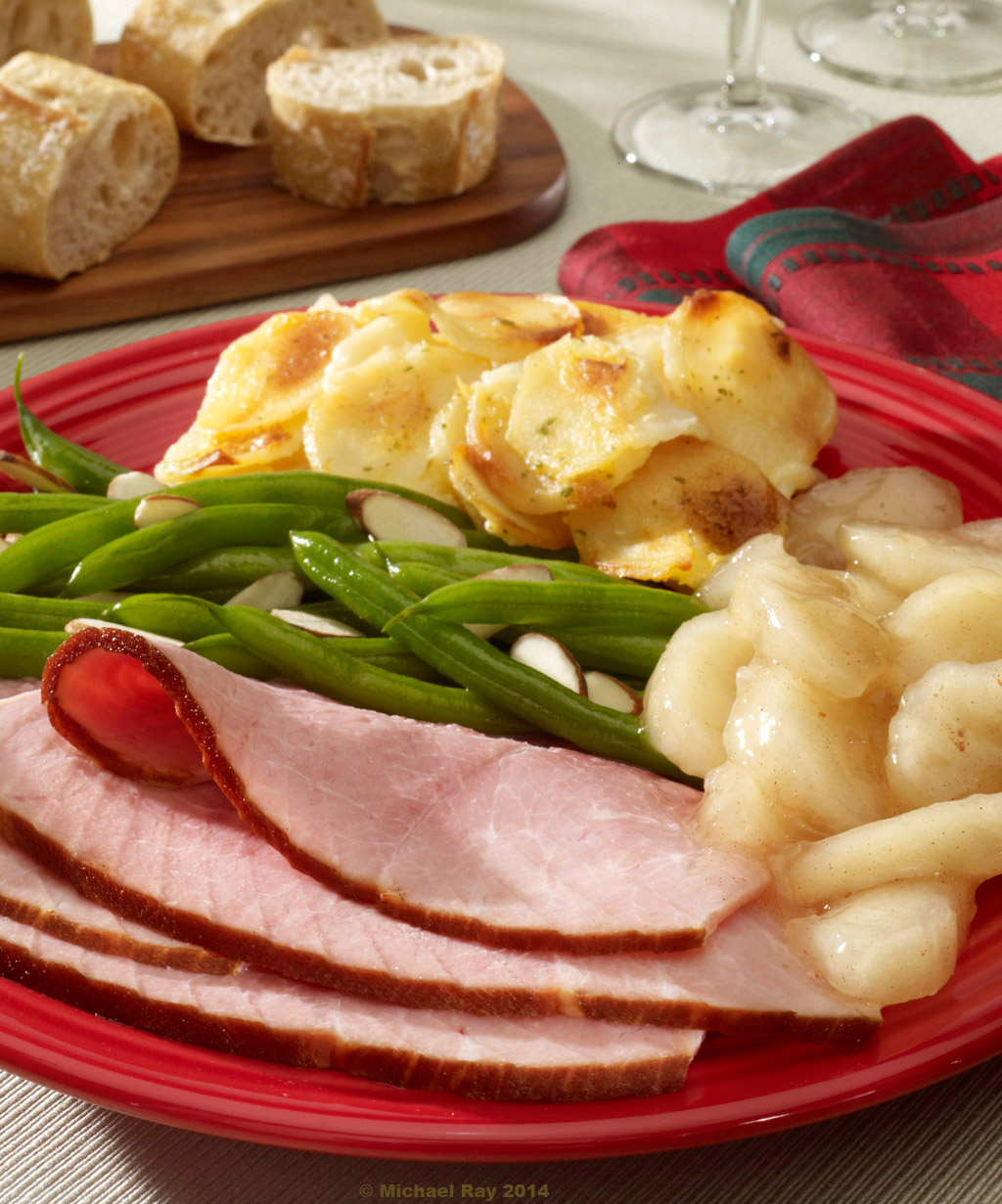
This is a very recent shot for me and I really love the napkin in this. It takes up compositional space very nicely and I love how the color adds to the mood and I especially like how the napkin curls up and overlaps the bottom of the wine glass. There’s a lot of “flow” there. I also like how the one layer of the napkin overlaps the other in such a way as to give the composition in that area a “step”. It’s freaking perfect! (if I do say so myself) :o)
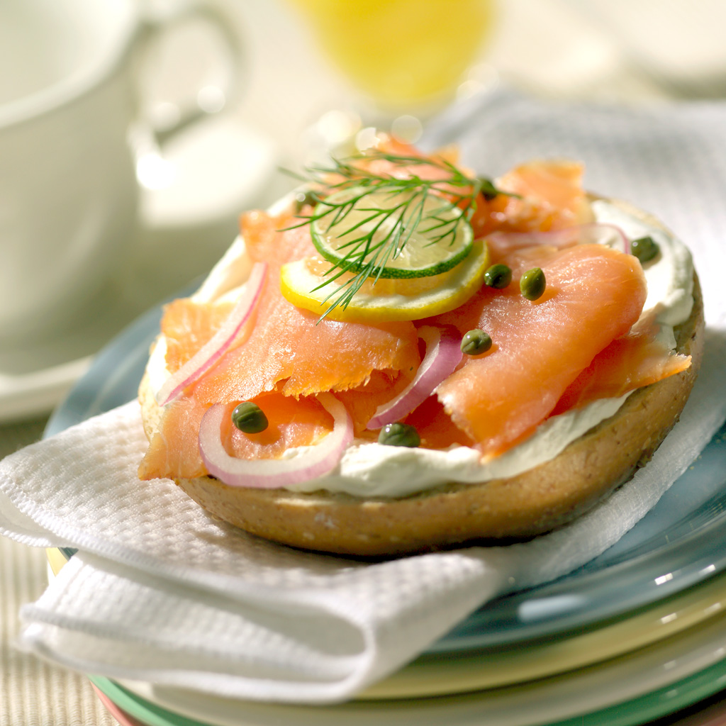
This is a very unusual use of a napkin, but it helps make the photo very casual and believable. It’s so imperfect, that it looks real. It might be a tad dominant, but I think it still works pretty well.
Thickness
Napkins come in all kinds of thickness. I hate thin napkins. Excessively think napkins are usually a bit hard to work with and usually look “cheap” to me. Most napkins are of reasonable thickness and work just find. Where it really shows is in the folded corner. If you can hold a slightly rounded fold, that’s a good napkin thickness. The kind of napkins I hate are the ones that, after folding, look like two sheets of paper sitting on one another. Yuck! At the same time, it’s not true that the thicker the better. There is a point where the napkin looks more like a dish towel than a napkin. That’s usually too thick.
Okay, that just about does it for my lecture on napkinology. Please let me know what you think of this article. I’d like your feedback and maybe you can ask some questions too. I’m sure I forgot to mention a thing or two and if you let me know what I missed, I can append this and make it the most detailed article on napkinology on the entire internet! Please leave a comment and sign up for my mailing list!!!!!!! :o)


Michael,
I must confess when I first read the title of this piece I was rather skeptical, generally I find napkins overused and somewhat contrived in food photography; like the”shabby rustic look” whichis so common these days and would seem to imply that all of our food comes from a19th century farm kitchen! However, I was wrong, I found your article both informative and thought provoking and will revisit my napkin collection with rewed enthusiasm!
Thanks and best regards,
Keith
Thanks Keith. I’m glad you got something out if it. Sometimes I think that no one reads this stuff… :o) I took a look at your food stuff. Very nice. I liked your remark about the “19th century” comment. I totally know what you mean. but you can’t fight trends either. I guess what I’m saying is that the the trends at least pull me in a direction. I think as photographers we are who we are, and the older we get, the more solid that foundation becomes. At the same time though, we need to keep up with the times. In fact, I think we can’t help be influenced by them. Thanks again for the comment.
Great article!! One of my favorite topics!
Hi, Michael — I’m so happy you wrote about this topic. The hero, rightfully, garners the most attention in food photography, but props in supporting roles can be so, so tough to get right. I signed up for your posts just a few weeks ago and have learned so much already; thanks so much for sharing your experience with us!
Thanks Amy. The funny thing about professional food photography is that as the photographer, I never really get to play with the food. That’s the food stylist’s job. But the napkins, that
s something I’m allowed to touch! :o)
Yes, …thanks for this….I’m a fan of playing with napkins, too.
Kinda weird for a guy, but at least we’re bold enough to admit it… :o)
While not a food photographer, I often have to shoot detail shots/vignettes for interior designers and “the napkin” can present problems on occasion. This was very informative. Also, I think the 19th century farmhouse trend is all about the farm to table movement and will stick around for some time…
I liked the description of “19th century farmhouse”. That was perfect! :o) And thanks for the kind words…
Hi Michael,
I keep on referring your website for food photography insights and I really loved this article. I liked the thing that you keep on repeating, “there’re no rights or wrongs”, as each creative person has his/her own style and sense of aesthetics. And you rightly said, that we should be open-minded to keep on experimenting with new stuff.
Coming back to Napkinology, how about explaining the right/wrong way of folding napkins to fill background holes? As there’s nothing right or wrong, mentioning both usual/unusual ways would be helpful. You never know who likes what! And it might become the most detailed article on napkinology on the entire internet!!