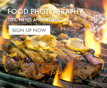
Food Photos like this are a little tricky. What’s cool about them is the the “scale” of the props, but without some kind of reference, that everyone can recognize, then the shot just doesn’t communicate the the reason the shot is cool in the first place.
Also, on a side note, I have to say that I’m a little disappointed in my new slate background. I think it looks good here, but it’s really harder to control than I thought it would be. And then again, maybe I just need a little more practice…


