Food Photography – texture vs mood
Food Photography is all about the details. You want to create shape and texture, but you can’t go so far as to ruin the mood of the image. There is usually a “mood” you’re trying to create. You’re trying to communicate that the food you’re shooting is in a particular environment that people can recognize and relate to. For example, you might be trying to create a “breakfast” environment. You’re usually not trying to sell “breakfast”, but the food you are trying to show is usually eaten at breakfast. I guess that point I’m trying to make is that you can’t go overboard on the texture and shape, at the expense of the mood of the photo. If you do, you’ll end up with some kind on incongruous mess.
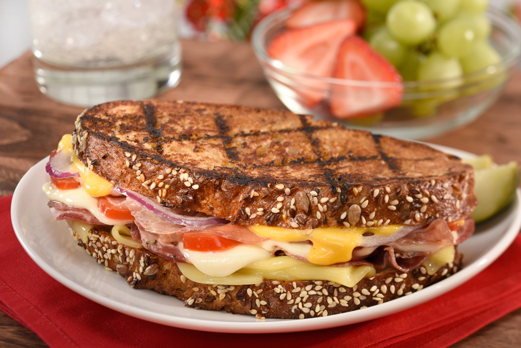
In the above shot, we were trying to create a mood in which this type of sandwich would be eaten. This isn’t a “moody” food. It’s more of a “fun” food and the environment and lighting support the attempt to display that idea. The shot is light and airy, even with a background surface that is a medium-dark. The flatness of the lighting supports the mood, but even though the shadows of the photo aren’t all that dark, there is texture and shape. The thing about this photo that I think is really sweet, is the shape of the elements inside the sandwich. You can see and almost feel the tops and sides of the cheese. There are some really nice highlights letting the viewer know that the sandwich is hot and moist. Overall, this is a pretty damn nice food photo, even if I do say so myself… :o)


Hi M-Ray:
I have a question. What is the face dimension of your “Glare light box”.?
I usually use a “large Chimera”, which is about 4′ x 5′, but I sometimes use a diffusion screen with a head or a box behind that. Usually, the bigger the better, but sometimes the edge of the box can be used to graduate the reflection or even put an edge on things. Kind of hard to explain. I’ll see if I can do a post on the technique…