
What Makes a Food Photo “Professional Looking”?
If you’re into social media such as Facebook, Instagram, Pinterest, or Tumbler, you’ve see a lot of really bad food photography and some pretty good work too… Have you ever asked yourself, that makes one food photo good and the other one not so good? If you’ve not a professional, it might be a little hard to put your finger on what it is that actually makes a difference. Anyone with an iPhone can take a picture of their food, but that doesn’t mean they’re a food photographer.
Trends – Like everything else that’s “artistic”, food photography is influenced by trends. The current trend in some types of food photography is actually toward “social media” looking photos. Of course not all photography needs to be shot in that look, but I think it’s interesting that there is a trend toward very casual photography. But “casual” doesn’t mean bad. There’s a difference and I’ll try to explain the differences.
Lighting
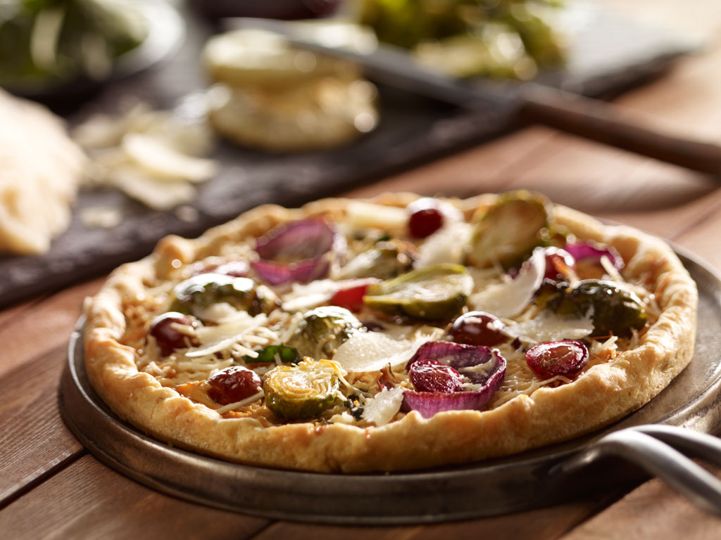
Probably the biggest factor making a food photo look professional is the lighting. Photographic lighting is not an easy thing to master, especially when it comes to lighting food. Different foods have different shapes, textures, and reflective qualities, and being able to light for each of these variables is not an easy skill to develop. It has taken me years and years to establish my food lighting prowess and it’s want separates me from other photographers. I use different lights for different foods. I will use mirrors, and other reflectors to our light exactly where it needs to be to make a particular food look as appetizing as possible. It’s a still, and not too many people have this skill.
Yes, photographic lighting is subjective, but especially in advertising food photography, the lighting must make the food look appetizing. In Editorial food photography, the food isn’t usually as important as the overall picture’s mood, but in advertising food photography, the intent is to sell food. To do that, the food needs to look appetizing, and the lighting must be more “informative” and less “moody”. Large moody shadows don’t usually make the food look good. The lighting need to convey information to the viewer and has to be manipulated by a talented photographer. Most Non-professional looking food photographers or more worried about having enough light to capture an image, while a professional will be more concerned about how the light is affecting the food.
Composition
While a lot of social media food photography looks pretty cool at first glance, if you begin to examine the composition, you’ll start go realize that elements of the photo are often out of balance or have other compositional flaws. The thing about print materials is that it must stand up to scrutiny. It’s not like video, where it’s there and gone in a second or like a quick glance of a Facebook page. In advertising or in magazines, the viewer will often really spend a lot of time viewing the photo. That’s when a non-professional photo will break down. Like it or not, whether it’s conscious or subconscious, people are comfortable with certain rules of composition and when those rules are ignored, the photo becomes less pleasing to the viewer’s eye.
Styling
Most non-professional looking food photos are very “imperfect styling”, having lots of mess and lots of crumbs. While there is nothing wrong with crumbs or messiness in certain types of marketing materials or magazine photos, there are times when these attributes make the photo less professional looking. Viewers usually like to see what there is to eat more than they like to guess what there was to eat… Sometimes cutting into a pike or cake and help make it look appetizing, there is such a thing as going too far. The effect might look “cool”, but ultimately will not entice people to buy a product or order a dish off a menu.
Exposure
Unprofessional food photographers sometimes totally miss a correct exposure, wanting instead a special effect. Or maybe they didn’t even WANT the effect, they just ended up with it, not knowing how to correct the thing. Having a food photo be too bring or too card is often a clue that tells the viewer that the food photo is unprofessional.
Focus
Professional food photos may have large areas of the image out of focus in order to direct the viewer’s eyes around the composition, or to emphasize a particular item in the photo, but there will always be something sharp and in focus. Unprofessional photos sometimes don’t manage to have anything tack sharp, and the entire photo will be just a little out of focus, usually do to camera movement.
Even with the current trend in food photography being toward a less structured and “more casual” look, there are photos that just do not look professional. Professional photos still have a look to them. They’re well composed, sharp, well lighted, properly exposed, and not too messy. The next time you see a food photograph and you wonder if it’s professional looking, try to analyze it these terms and more often than not, you’ll be able to tell. And then again, maybe you won’t… Just remember on thing though, there’s a difference between “looking cool” and “selling food”. The next time you see a very “cool food photo”, ask yourself if it makes you want to eat that food. If it doesn’t, then maybe it’s not doing its job. And if it’s not doing its job, its not really professional.
If you find yourself in need of a professional food photographer and had made professional food photos for some of the biggest food-related companies in the country, then please give me a call at 412-232-4444 of email me, or at least take a minute and check out my food photography portfolio.
Take care
