
Food Photographer Critique – Ham Photo
I thought it would be interesting and informative to novice food photographers to hear what a professional food photographer thought about a particular food photo, especially if that food photo was one of his own.
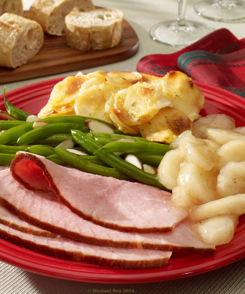
Composition
The overall composition of this photo is quite strong, at least in my opinion… I love how the negative space (tablecloth) winds its way through the image. It seems to have good balance with the beige showing through more on the bottom left and also on the top right. The original image had more head-room on it, but I ended up cropping in tighter for my own use. So often, clients insist on shooting wider than the intended crop, just so they have some wiggle room later, which is totally understandable. To me, the crop feels comfortable, not too loose or too tight.
I don’t see anything that is being cropped in an odd way or any real tangent issues. All the “overlaps” of the various food items and props feel comfortable to me.
There are only two things that bug me about the shot that I wish I could change. One is a lighting thing and the other one is sort of a styling thing. I should of noticed both of these things while shooting, but didn’t. I try to take my time and really look at the shot before the final exposure, but there are always distractions or people pressuring you to get done, or onto the next shot, or you know the food quality is deteriorating and you want to shoot the thing before it dies on you. But, you do your best…
There is one almond slice just peeking through, behind the fold of the ham. It just peeks out a tiny little bit. It would of been much better if it didn’t show at all and it would of at least been acceptable if it showed up more that it does there. At lease that way, you’d know what it was. The way it is now, it’s just distracting. I’m half tempted to go in and try to retouch it out of the frame. It’s what bugs me most about the shot.
Besides the out-of-place almond, there’s one other thing that I see as a mistake, and I’ll talk about it later, but for now, see if you can guess what it is… :o)
I have to admit this, but I have this “thing” about napkins, and I have to say that I outdid myself here… :o) To me, the napkin is working out really well in this shot. It’s a good color, pattern, the fullness of the material and the way it “dents”, help give the shot a little “softness” that’s hard to articulate, but it’s there. The napkin is folded nicely and it’s fitting into the composition like it was made for the shot. I love it! It’s interesting if you notice it, but not distracting. Napkins are important to the composition of the shot, but in reality, we’re not selling napkins here, so it’s important that it does its job as a compositional element and not be too noticeable. It has shape, looks soft, and doesn’t distract. I REALLY love it! :o)
I think that the composition of the food on the plate is nice and “casual” and I really like how the tip of the green bean on the left hand side of the frame, swifts up. If it didn’t, the sharp point ending right at the crop, might of been distracting. It almost looks like I used the Photoshop “liquefy” filter to keep it from exiting the frame. In reality, it was just stupid luck.
Even though I can’t take any credit for the composition of the bread, I must say that I was smart enough to not mess with it when AnneMarie (the food stylist) placed it on the set. Actually, I did move one piece, just an itty-bitty bit, maybe a quarter of an inch or so. It was just barely touching another piece, so I moved it, but the original bread arrangement was GREAT! It looks casual but still interesting. I definitely could not have done a better job myself. Doing “casual” is much harder that it looks.
Teamwork
If you’re working with other team members, like a prop or food stylist, you need to be able to let these people help you! They bring a lit to the table and it’s a good idea to let them do their thing… Yes, the final say is yours, or more truthfully the Art Directors, but it’s a good idea to let others do their jobs. If something needs to be changed, then change it. (preferably when no one is looking :o)
Probably the last thing I really like about the composition is the use of the two wine glasses. I love the way the one glass tucks under the napkin and the other crops out of the top of the photo. They’re doing their job of taking up space without being distracting. Chances are you probably hardly knew they were there, and that’s a good thing. We needed something to suck up some space, and still be relevant to the shot. The wine glasses were the perfect thing and they worked out perfectly.
Food Photography Lighting
The lighting rocks, if I do say so myself… :o) I used my trademark / favorite fresnel spotlight again. The food has great shape without too much contrast. The shadows in the shot are crisp, but not too distracting. The highlights are where they need to be, not too “hot” and not too “flat”. The lighting rocks! :o)
There is a technique that I use that I think takes my photos to a level beyond most other food photographers and I’m going to share that secret with you… Don’t get me wrong, I’m not THE best food photographer on earth, but better than some. See the little shadows at the upper middle of the photo, on the tablecloth. You may not think it is all that big of a deal, but I think it helpmake the photo more “believable” as a real photo in a real environment. Subconsciously, the shadow of something outside the frame, tells the viewer that there is something beyond the crop of the photo. It makes it look like there is a real environment that viewer can’t see, when in reality the tablecloth is setting on an 4’ x 4’ particleboard table, in the middle of a dark 50’ x 50’ photo studio.
This brings us to the mistake in lighting. It’s not a big deal, but it bugs the hell out of me. Have you found it?
See the light space, at the top of the frame, between the two pieces of bread? I think it’s way too light and I should of placed a cast shadow in that space, just like I did in the middle of the frame. I think that area is too light and distracting. I guess that I could do a little “burning” in Photoshop, but I should of caught that when I shot it.. BTW – the photo you are looking at is un-retouched. Okay, I played with the colors and levels a little, but no retouching, no cloning, burning, or anything like that.
Food Styling
Like I said earlier, AnneMarie did a great job as a food stylist on this shot. The food looks moist and appetizing and the actual composition and placement of the food on the plate is perfect. Okay, maybe not perfect, but just imperfect enough. I’m trying to get away from perfect. I especially like the fold of the ham. The idea was to give the shot a little reality and a little depth too. It worked. I think that the food looks great and is arranged naturally and causally, helping to make the shot look real.
Propping for Food Photography
This food photograph was shot for a local grocery store chain, for a Christmas direct-mail piece, hence, the red plate. The tablecloth is actually green in color, but for some reason, the digital back on my camera didn’t do a very good job of capturing that color. Oh well… I don’t think it matters all that much to the success of the photo.
The cutting board is nice, but me for some reason, it seems a little out of place to. I don’t think it’s terrible, but it bugs me just a tiny little bit, but I’m not quite sure why.
Camera Work
For this shot, I went with a little wider lens than I normally use for my food photography. The idea was to make the front element (the ham) a bit more prominent than it would of been otherwise. By using a shorter lens, the plate and the ham was sort of stretched toward the camera. The main reason I did this was so we could “look down” on the front of the plate a little more without needing to raise the camera angle. The reason this was an issue, was because the lip of the plate was a little steeper than I needed it to be. If I would of used a more telephoto lens, this shot would have been totally different. We would of been looking at the underside of the front of the plate and not at the ham.
Since we were trying to see the food items on the plate, I couldn’t go with as shallow depth of field, as I normally would of, but I still think the shot works pretty well. Shallow depth of field tends to make the shot a little more romantic. But as they say, commercial photography is unlike other photography. It has a job to do. The job here was to sell everything on that plate. If the potatoes went too soft, the potato manager might of bitched… :o)
So there you have it, the armchair quarterbacking of a food photographer regarding his own photo. If you’re a novice food photographer and you’re here to learn something, I hope you did. If you’re not a photographer looking to improve your skills or your understanding of the craft of food photography, you really need to get a life… :o) This shit has to be really boring to you…
Shameless Self Promotion of my Food Photography Site
I need a favor! If you like what you’ve read here and want me to do more of it, please let me know. Writing this takes a lot of effort and if nobody is reading this, I really have better things to do… So here’s the favor I need, actually there are two favors.
- Comment down below and let me know what you think of this, good or bad, it doesn’t matter.
- What I’d really like from you is a link! I’m doing all this writing for SEO reasons and the more links I get, them higher my Google ranking will be, so please, if you think this is quality content and you have a web site, please link to my food photography site. The URL is http://www.foodportfolio.com and please mention something about “food photographer” or “food photography” in the description of your link.
Thanks!!!!!


Thanks Michael very informative .
Michael:
I have been a student of yours for a couple years. I was originally a table top guy all those years ago. Made a few bucks and then went back into Manufacturing and Purchasing. Now I can afford to do what I love again. I believe that Food is the most complex thing to light and shoot and I love that.
I want to say that your blog was good and useful two years ago.
Now it has grown to verrrrrry good. As I said I had chosen table top as my specialty back in college photography school. Back when you were playing with toy trucks. You have reminded me of some things that I had forgotten that are useful. And you have introduced me to some new concepts that I had never thought of. Scraping light is one of them. And you have added something recently I don’t remember you speaking of a couple of years ago. I think you called it the “Glare light”? I certainly don’t remember that from 2012-2013. Good thing to use and I can light the fork with it. And last you reminded me of drawing school and lighting shapes. So now I have to set up the table and lights and practice lighting cylinders, spheres and plains.
I had recently re-discovered your new blog when I was suggesting a friend visit it to learn a bit about lighting and food.
Thanks Michael.
Still your student
Dan Erb
Puerto Vallarta MX.
Thanks Dan! I really appreciate the feedback.
Michael,
Thank you for this.
I like how you discussed what lens you used and why.
I did not notice the almond slice until you mentioned it. Even now, it does not bother me.
I disagree with your point about the bright area between the slices of bread. This is because you show shadows therefore the average consumer would expect a light source to be throwing those shadows such as a large window. If you darkened the area, I believe it would seem odd because it is nearest the light source (window) so should be bright.
I believe it might have helped if you included a behind the scenes photo to show your lighting setup. There must have been more than a Fresnel light involved. Surely there were reflectors or other fill. For example, I see soft fill from camera left that throws a soft shadow to the right of the wood.
Plus, there is a hard catchlight on the corner of the cutting board that says to me that a large soft light source such as a silver reflector was on camera right that caught some of the Fresnel and bounced it back into the scene. Yet none of the potatoes have a bright reflection from it so there was probably something on camera right to block or soften it – either a black card or a scrim.
Maybe what bothers you about the cutting board are the lines in the wood? It looks new. Think about what if you had used an old beat up cutting board, would that have been better? Would it have said “family” more than the one you used?
Keep up the good work.
Terry Thomas…
the photographer
Atlanta, Georgia USA
I think you’re right. Just like how everyone is used to fast food, photography buyers are getting used to the new looser, less well-lit, look. I just remembered that I have a shot of the set, after I took the food away. I’ll post it in a bit. It will show the lighting. To be honest, I didn’t take many behind the scenes photos of this because I really didn’t think the shot would turn out as well as it did. It’s not a glamorous kind of shot, but these are the kind of shots I get hired to take. More information than glitz.
Great information. Thank you for sharing.
Thanks Micheal for the post. Composition and styling and lighting does make good photography. Whilst many thinks photography is just meh…then we come and take their photo and they go wow…how did you do that…. it’s like saying. you are a chef…you are good at that. so stick to it..
I think you’re right. Just like how everyone is used to fast food, photography buyers are getting used to the new looser, less well-lit, look.
Great information. Learned a lot. Thanks Michael.
Thanks! :o)
I enjoyed your post and did not find it to be a waste of your time in any way! I love behind the scenes info and hearing why other artists do what they do. Keep it up!
Hey Michael –
I am a big fan of the blog and it has really helped me to understand the technical side of food perspective from the shooters point of view. I am a pro food stylist and culinary producer and am trying to improve my own photo skills. Even though I have been doing this for years, I can only learn so much on set as I am busy with my own tasks. I am in the process of re-branding (currently listed as Food Crew in you directory), I will be launching a new portfolio site http://www.JeffParkerCulinary.com that will focus just on food styling and production.
Please keep up the excellent work. I know what a challenge keeping a blog running as I maintain a few sites (the reason for the rebranding).
Cheers – Jeff
Thanks Jeff. It’s nice to see people are actually reading and appreciating my work. Good luck and keep in touch.
Great article, didn’t notice the almond or lighting until you mentioned it. I always try to read your blog.
Love it.
Thanks Diane… How’s the quilting going? Anything cool to share?
Michael, thanks for all of the work you do and the suggestions and techniques you pass on. I’m pretty new to photographic lighting but have really enjoyed and found useful many of the trips and information that you have included. I also find the observations and ideas in the “comments ” section submitted by you reader.
Please keep up the great work
Tom Ireton
LaPaz Mexico
You’re very welcome… Thanks for taking the time to reply.
Still getting views in 2019 🙂 I’m a working professional food photographer in Orlando, always something new to learn and I’m enjoying your work and articles. Thanks for taking the time to share.