
Food Photographer Critique
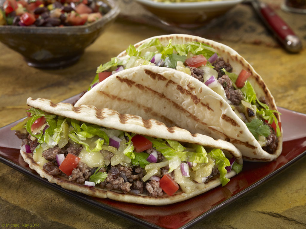
This is an image I just got permission to release. I photographed this food about a month ago and was asked not to release it for a month, until the packaging was released. I have to be honest. I really like this shot and there’s a bunch of things I like about it and wanted to talk with you about the things in the photo that excite me.
There’s a lot I like about this image, but I think it all begins with the color pallet of the shot. The rust color of the background works well with the food and the red of the plate, which needs to be in every shot for this client. Works well too. The actual product is the bread of the taco, and I think it really jumps off of the background because of the color of everything in the shot. The human eye tends to gravitate toward the lightest thing in a photo, and in this photo, that’s the bread. Even the Chrome of the fork is darker than the bread. And since we’re talking about color, I really like the way the color red leads you around the composition of the photo, from the plate and peppers, up to the fork and then over to the contents of bowl C, and back to the taco. I think that was nicely done.
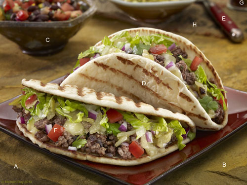
A – It’s really not all that noticeable, but the letter A is right on the edge of the stone background. For some reason, I like getting the edges of surfaces in the shot. Maybe it’s just me, but I think this adds a little depth to the shot. I guess it’s just me… :o)
B – The texture of this surface is really nice. The stone itself isn’t all that much larger than the crop of the shot, but I really like the background. Did I mention that I like the background? :o)
C – Right next door to my food photography studio is the pottery shop of a good friend of mine. I “borrowed” a couple of his pots for this shot. Dale does some great work and I’ve wanted to use one of his pots for the longest time now, so this is a personal reason I like the shot, but I just wanted to mention it…
D – Can you see how the light is scrapping across the bread? Especially since that’s the main subject (product we’re trying to sell), it is important to show as much texture as possible, without making it look weird. The light that creates that texture is reflected from a mirror and not the main light. Using mirrors, I can scrape light pretty much anywhere I want… I’ll probably be making a separate blog post on how to use mirrors I a later blog post.
E – When I bought that fork, I never thought I’d use it, but here is, and I love it… The client took some steel wool to it and distressed it a bit and toned down the shininess of it… I love the angle of the fork. It takes up the space nicely and adds to the flow of the composition.
F – I think that the lighting on the ingredients of the taco is pretty good here. I often, in hindsight, over-light the ingredients. Since I usually end up zapping some mirrors into this area, it’s easy to go a little too far… I think my effort here looks natural, without being under or over lit.
G – Too many food photographers end their compositions entirely in the frame of the photo. I think this is a mistake. I think it helps to bleed some of the props, giving the viewer’s subconscious the idea that the environment keeps going beyond the composition and is therefore more likely to be “real” and not something made up in a studio. You don’t even know what that thing is, and that’s not really important to its function. It’s just something else that give’s the viewer the clue that this is real. It’s not distracting, it’s just there…
H – I think that the cropping gets a little weird where it crops off the top of the bowl to the left, but I really like the way the props are arranged in the background. It looks casual, but it’s still composed nicely. I love the burlap napkin kind of this used in this shot. The tone is perfect and appropriate in feel, with the other props in the shot. I really like the way the props weave and overlap.
I – If you read my previous post on “Glare light”, you can see it’s tactful use here. I think that it really adds a little spice to this shot. I might be a tad high in intensity, but overall, I think it’s a positive addition to the lighting scheme
Conclusion
Whenever I look back at any food photo I’ve taken, there are always parts of it that I’d like to do over again. If there weren’t, I’d either be God or I’d have given up… Yes, I’d change a couple of things but overall, am pretty pleased with this way this shot turned out. I hope it’s been helpful to see a food photo from a professional food photographer’s point of view. If you can, please take the time to leave a comment or ask a question.
And as always, I’m sorry for all the typos and mistakes. Please feel free to contact me about any corrections I may need to make… I like to write but I hate to proofread. :o)