
Parfait Food Photography Critique
I shot this food photography of this Parfait just this last week. While I have to say that I’m very happy with the overall results, I usually find it useful to critique my own photo after the fact, and think of what I might of done differently. Here’s what I cam up with.
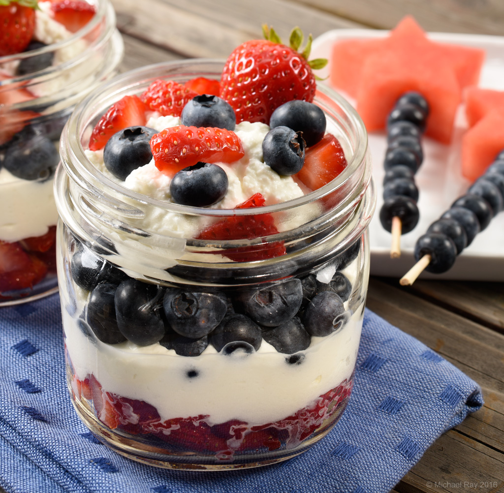
Composition – As a food photographer, I’m always looking at food photo compositions. I like to try to detach myself and look at my photos and other people’s shots as objectively as possible. That’s not an easy thing to do. I like to try to look for compositional themes that repeat in photographers’ photos. Hopefully, that will keep me from ever falling into too deep a rut. I don’t want all my photos looking too similar. Having said that, my preferences usually make themselves known and many of my photos end up looking too much alike. This photo is a good example. The sticks with the blueberries fit too perfectly into the composition’s negative space on the side of the frame there. I actually tried to create something more “random”, but just couldn’t bring myself to leave it that way. I think my compositions are becoming too structured. I need to work on that… In hindsight, I think I’d like to have made the fold more casual. I tried, but couldn’t come up with anything I liked. I wish I had tried harder.
Lighting – The lighting is good I think. I especially like the texture in the top layer of the parfait. I think it’s jusssssst right. The only think I see, that most non food photographers would miss, is the small highlights on the shoulder of the jar. You can just barely see the rectangle highlights of my soft boxes. With curved glass objects, specular highlights are inevitable, but since the sun is round, the highlight should be two and since there is only one sun, two highlights wouldn’t be realistic either.
Propping – I like the propping. I think the food stylist did a wonderful job as usual. The only thing that bugs me a little is the fold in the napkin. It’s a little tough. I saw the problem before the final image and tried to mess with it, but it just wouldn’t behave. It didn’t seem to bother others in the team, so rather than take the entire shot apart to try to fix it, I let it go. It still haunts me a little…
Focus and Depth of Field – I’d have preferred to go with a little less depth of field, but we needed to sell the watermelon too, so we ended up having a bit more focus than I would have preferred, but that’s commercial food photography
Overall Conclusion – I like it… :o)
Camera – Nikon D810
Lens – Nikon 85mm f2.8 Tilt Shift